Featured

What is Kombucha? All About This ‘Immortality Tea’.

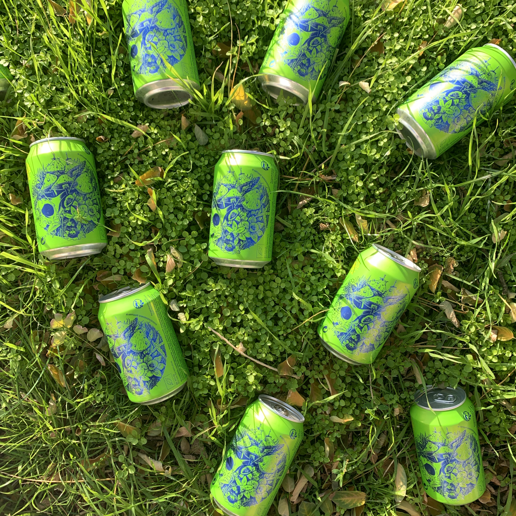
Kombucha is more than just a drink; it is a fermented tea packed with micro-organisms, probiotics and other healthy substances. But how do you make it and why do people call it called the ‘Immortality Tea’? Dive into the fascinating world of kombucha to discover this and more.


6 of our Yugen Kombucha flavours in bottle. You can buy them all in our online store.

What is Kombucha?


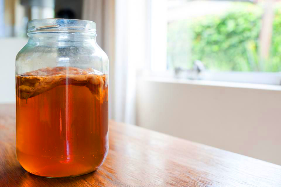
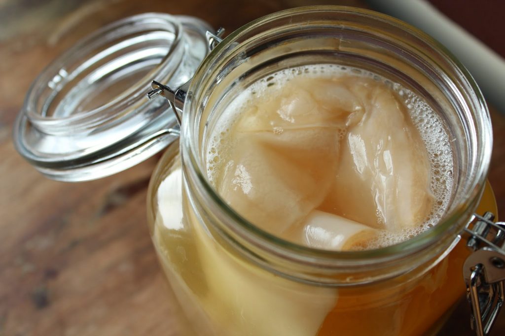
Kombucha is a fermented drink made from black or green tea, sugar, and a culture of bacteria and yeast known as SCOBY. The fermentation process takes about a week and results in a drink with slight carbonation, altered flavour and added health benefits.


SCOBY (Symbiotic Culture Of Bacteria and Yeast) in a clear glass jar, showcasing its layered structure and texture.

Health Benefits of Kombucha


  1. Antioxidants: Kombucha, especially when made from green tea, is packed with antioxidants. These antioxidants play a crucial role in protecting our cells from free radical damage, which contribute to ageing and disease.


  1. Stomach and bowel function: The fermentation process of kombucha creates healthy bacteria. These probiotics promote healthy gut flora, which is essential for optimal digestion and overall health.


  1. Digestion: The enzymes and acids produced during the fermentation process of kombucha support digestion. They help break down and digest food, leading to more efficient absorption of nutrients.


  1. Anti-inflammatory: The acids and enzymes in kombucha have anti-inflammatory properties. This makes it particularly beneficial for reducing inflammation, especially in the intestinal system.


  1. Immune system: Kombucha is rich in vitamins, especially vitamins B and C. These vitamins, combined with improved gut health, help strengthen the immune system, making the body more resistant to disease.


  1. Skin: The antioxidant and anti-inflammatory properties of kombucha are not only beneficial for internal health, but also for the skin. It helps cleanse, refresh and revitalise the skin, leading to a healthier and radiant complexion.


Origins and History


Although kombucha has recently risen in popularity, its exact origins remain shrouded in mystery. Most historians believe it originated somewhere in the Far East, with some tracing its origins to the Manchurian region of China around 220 BC.


Through trade routes, kombucha reached both eastern and western Europe. From the imperial courts in Japan in the fifth century to the Russian Babushkas in the Soviet era, kombucha made its mark everywhere.


Our favourite legend tells of a Tibetan monk who let a pot of fresh tea cool outside. A gentle mountain breeze carried with it wild yeast cells, which happened to end up in the sweet tea. The teapot was forgotten, creating a culture that transformed the tea into the invigorating kombucha. After discovering the miraculous properties of this accidental find, the monk shared his precious discovery with others, and thus a legend was born. The Immortality Tea!


In the 1960s and 1970s, kombucha ventured to American shores. The hippie culture, always looking for the authentic and the natural, embraced this unique drink and nicknamed it ‘hippie tea’. As the years passed, these hippies shared their passion for kombucha with their children. This cross-generational love created a growing demand, leading to the emergence of the first commercial kombucha in the 1990s. And so GT’s Kombucha was born, founded by George Thomas Dave, and now recognised as one of the largest kombucha producers in the world.


How to Choose the Best Kombucha?


For the most authentic experience, consider fermenting your own kombucha. However, this requires careful attention and a sterile environment. Read about it here in our ultimate guide to brewing kombucha yourself.

When you buy ready-made kombucha, you face a choice between pasteurised and unpasteurised varieties. While pasteurisation can extend the shelf life and you shouldn’t keep them cold, it comes at the expense of many of kombucha’s healthy properties. Non-pasteurised kombucha retains all its natural health benefits, making it the better choice for those who want to get the most out of their kombucha experience. Read more about the differences between pasteurised and unpasteurised kombucha here. 

Kombucha offers a range of health benefits and is a healthier alternative to sugary soft drinks. Whether you choose homemade kombucha or a ready-made product from the shop, it is worth adding this beneficial drink to your diet.

Featured

Cosa s’intende con “colture viventi” e cosa sono?

Yugen Kombucha ospita miliardi di microrganismi buoni in ogni sua bottiglia. Il kombucha tipicamente contiene Acetobacter, Gluconobacter, Saccharomyces cerevisiae e Lactobacillus. Questi batteri e lieviti benefici aiutano a popolare l’intestino con una flora sana utile per la digestione. Li troverai anche in altri prodotti fermentati e non pastorizzati.

Featured

In che modo Yugen sostiene iniziative sostenibili e/o di riciclo?

Tutti i nostri ingredienti sono certificati biologici. Il nostro packaging è riciclabile al 100%. Utilizziamo solo carta certificata FSC per le nostre scatole e volantini. Il nostro kombucha è 100% vegano e non usiamo aromi, estratti, dolcificanti, conservanti o coloranti nè artificiali nè “naturali”. Per ogni bottiglia e lattina che vendiamo, doniamo due centesimi alla Fondazione Yugen che aiuta progetti sociali e sostenibili.

Featured

Cos’è il kombucha?

Il kombucha è la tradizionale bevanda a base di tè fermentato dell’Estremo Oriente, ricco di culture viventi, acidi sani e antiossidanti. Il kombucha viene preparato con acqua, tè, zucchero e uno scoby (cultura simbiotica di batteri e lieviti). Lo scoby si nutre dello zucchero presente nel tè zuccherato e lo trasforma in kombucha gustoso e leggermente frizzante.

Featured

Cosa vuol dire ‘produzione artigianale’?

L’ eccellenza di un kombucha viene definita dall’utilizzo di ingredienti premium e da un perfetto processo di fermentazione. Tutti i nostri vasi di fermentazione e serbatoi lager sono realizzati in acciaio inossidabile di altissima qualità. E grazie ad anni di ricerca e sviluppo e alla collaborazione con l’università locale, siamo in grado di garantire un prodotto di altissimo livello con il massimo del sapore e il minimo contenuto di zucchero e alcol.

Featured

Perché bere kombucha?

Ci sono molte ragioni per bere il kombucha. Alcune persone lo bevono come parte integrante di una dieta sana. Il kombucha greggio contiene infatti microrganismi vivi, acidi organici sani e antiossidanti. Altri lo bevono per il suo gusto rinfrescante unico. La sua aspra acidità combinata con una leggera frizzantezza lo rendono un’alternativa perfetta alle normali bibite zuccherate, e persino alle bevande alcoliche.

Featured

Cos’è e cosa fa la Fondazione Yugen?

La Fondazione Yugen ha come obiettivo l’aggregazione di persone con a cuore il bene dell’ambiente e desiderose di creare un impatto positivo per il pianeta. Per ogni bottiglia o lattina vendute, doniamo 2 centesimi alla nostra fondazione, e i fondi raccolti vogliono sostenere i principianti impegnati in progetti sociali e ambientali e promuovere un approccio più umano al prodotto, alle persone e al pianeta.  

Featured

Cosa vuol dire “Yugen”?

La parola “Yugen” esprime il nostro modo di vedere il mondo. E’ un concetto giapponese usato per lo strabiliante sentimento di ammirazione nei confronti della bellezza della natura. Al giorno d’oggi ci troviamo ad affrontare diversi problemi e sfide, e per questo ci piace aiutare le persone a rallentare, rilassarsi e godersi ogni attimo della vita.

Featured

‘The Afterlife’ van Bue The Warrior

Yugen werkt samen met lokale kunstenaars om het oude Japanse begrip “Yugen” te conceptualiseren. Via hun creaties illustreren zij hun unieke interpretatie van dit begrip. Het is hun persoonlijk eerbetoon aan de schoonheid van de natuurlijke wereld en de verwondering voor de subtiele details van het leven.

In deze doorlopende serie stellen we elke illustrator een aantal vragen: Wie zijn zij, wat is het verhaal achter hun ontwerp, en wat houdt de toekomst in? Laten we diep in hun gedachten duiken en hen vergezellen in hun denkbeeldige wonderbaarlijke wereld.


Wie is Bue The Warrior a.k.a. Dave De Rop?

Dave komt uit een tekenaarsfamilie. Zijn vader en grootvader zijn beiden medewerkers van Willy Vandersteen geweest. Dave is dus opgegroeid met comics, tekenfilms, en stripverhalen. Het tekenen werd hem van jongs af aangeleerd.

Toen Dave 13 jaar was verhuisde hij samen met zijn moeder vanuit Antwerpen terug naar Gent. Zijn jeugd spendeerde hij ‘on the streets’. De invloed van de hiphop en skate cultuur draagt hij nog steeds mee. “De subcultuur heeft mij gevormd, en de creativiteit en muziek van toen heeft de fundering gevormd voor wie ik nu ben”. Al is zijn skateboard momenteel vooral een design element, “armen en benen breken klinkt gewoon niet zo aantrekkelijk meer”, de creatieve vibe in de scene heeft zijn artistieke toekomst, en herkenbare graffiti stijl, vormgegeven.


Wat is Bue zijn stijl?

Zelf beschrijft hij zijn stijl als “simpel, super herkenbaar, naïef, kinderlijk, positief, good vibes”. Terecht, iedere Gentenaar is bekend met Bue zijn speelse vogels. Je ziet ze overal, en iedere keer wens je dat ze ook konden fluiten. Ze zijn ondertussen zijn trademark geworden, oftewel “tag” in de graffiti scene. Maar in tegenstelling tot klassieke tags die vaak als vandalisme worden bestempeld, worden de tekeningen van Bue als kunst ervaren.

Individuen of bedrijven die Dave benaderen doen dit dan ook vooral omwille van zijn eigen unieke stijl. Dave hoeft geen richtlijnen op te volgen, “ik ben geen grafisch ontwerper die zich moet richten naar de wensen van de klant, mensen contacteren me vooral voor Bue, niet voor Dave”.

Dave vindt zichzelf niet de meest talentvolle tekenaar, maar hij heeft wel iets gecreëerd dat herkenbaar en uniek is. Zijn werk is niet politiek getint of maatschappijkritisch, maar dat hoeft ook niet, “uiteraard zou ik ook een coronavirus manneke kunnen maken, maar dat is te gemakkelijk”. Hij houdt ervan om zijn eigen stijl te zien evolueren in de tijd, net zoals andere grote namen als Hergé (Kuifje) of Peyo (Smurfen) ook een evolutie meegemaakt hebben binnen hun eigen context.

Waar ligt Dave zijn creatieve focus nu?

Dave is in 2015, op zijn artistieke hoogtepunt in België, geëmigreerd naar Mexico. Een moedige en onbekende stap. Artiesten in België worden over het algemeen beter betaald dan in Mexico. Maar geld alleen heeft Dave nooit kunnen motiveren. De aantrekkingskracht van het land was groot en het avontuur lonkte.

“In Mexico noemen ze me ook wel – The Birdman”. In zijn eigen restaurant “Holly Waffles” en op lokale farmers markets verkoopt hij zijn merchandise en art, vaak aan mensen die eerst zijn werk herkennen alvorens zijn alter ego “Bue”. Hij vindt het spontaner wanneer zijn tekeningen herkend worden omwille van de stijl dan omwille van de tag. “Faam boeit me niet, vandaar dat ik niet altijd mijn werken signeer met Bue, zolang mensen het maar mooi vinden”. Mexico heeft een indrukwekkende art scene. Ondanks dat zijn naam tot ginder reikt voelt hij zich een kleine vis. Sommige van de huidige kleppers in de mural en street art community stonden nog in hun kinderschoenen toen Dave al een gevestigde waarde was. “Ik draai al langer mee, feit dat ik vandaag respect krijg van artiesten die 100x groter zijn dan mezelf komt omdat ik veel mensen beïnvloed heb.” De jonge garde van vandaag evolueert ook veel sneller, vooral dankzij het internet en beter materiaal.

Om centen te verdienen in zijn nieuwe stad opened Dave samen met zijn toenmalige vriendin een wafel restaurant/art gallery, “Holly Wafels”. “De meeste mensen die wafels komen eten hebben geen clue dat de kunstwerken van mij zijn. Dat interesseert me ook niet, ik ben niet zo’n artiest die per se de artiest wil uithangen. Ik zie mezelf niet als een kunstenaar, maar gewoon als iemand die veel tekent. Iedere vrijdag worden er trouwens ook werken van andere artiesten geëxposeerd.”

Na vijf jaar wafels bakken in Mexico City is Dave bezig met de opening van een tweede locatie in Reno (VS). “Een opportuniteit, want familie van mij die ginder woont wil helpen met de oprichting. Ditmaal met getrainde chefs en managers, want na 6 maanden over en weer vliegen zou de boel ginds up and running moeten zijn.” Omwille van de huidige Corona maatregelen is zowel het restaurant in Mexico-city als het project in Reno stilgelegd. De tijd die hierdoor vrijkomt gebruikt Dave om veel te schilderen ter voorbereiding van zijn expo.

Wat is het verhaal achter het Yugen design?

De schedel stelt vanzelfsprekend de dood voor. Maar de dood wordt in Mexico gevierd, niet gerouwd. “Een doodskop wordt hier niet direct geassocieerd met satan, de duivel of metal. In de Mexicaanse cultuur wordt de dood gezien als een natuurlijk onderdeel van de menselijke cyclus. Ze eren en vieren de dood tijdens de dag van de dood of “Día de Muertos”. Mexicanen beschouwen het niet als een dag van verdriet, maar als een feestdag omdat hun geliefden wakker worden en met hen vieren. Immers, na de dood komt ook terug leven”. Die eeuwige cyclus is een essentieel onderdeel van al het leven op aarde. Het natuurlijke ritme van leven en dood, en de schoonheid van iets wat er niet meer is wou hij meegeven in het design. “Onlangs zag ik een foto van een dode vos waar de lege oogholtes dienden als een soort natuurlijke vaas voor bloemen, een perfect voorbeeld dat zelfs de dood ook iets goeds in zich heeft”.

Zeker in deze uitzonderlijke tijden van pandemie en angst is het geruststellend om te beseffen dat de bol door draait. Het leven zal er altijd zijn, met of zonder ons eigen persoontje. “Al de paniek die er nu is komt vanuit het egoïsme van de mens. Misschien gaan we ziek worden en doodgaan. Misschien verdienen we dit wel, check wat we allemaal aan het doen zijn met de planeet. Het klinkt niet leuk moest ik komen te sterven, zeker niet nu ik net een kleine heb, maar fuck it. Uiteindelijk heb ik ook meegedaan aan de miserie van moeder aarde. Even een reality check. Het gaat niet enkel om ons.”

Waarom is Dave naar Mexico verhuisd?

Een reeks van toevallige ontmoetingen hebben ertoe geleid dat hij in dit land, met zijn machtige hoofdstad, zijn hart verloren heeft. In 2007 was hij samen met zijn maat Chase, die andere Belgische internationale kunstenaar en graffiti artiest, een mural in Hollywood aan het schilderen toen een dame uit Puerto Vallarta (Mexico) hen gadesloeg. “De goden hadden haar zogezegd naar ons gestuurd om ook in haar stad een muur te schilderen. Een maand later was alles geregeld: sponsors, vliegtuig, resort en fee.” De vibe van westkust Mexico beviel Dave, hij wou meer zien, maar het zou tot 2009 duren vooraleer hij een tweede keer voet aan wal zette. Ditmaal na uitnodiging van een fan uit Mexico City die hij een aantal jaar ervoor had ontmoet in de Hoogpoort te Gent. “Vanaf dan keerde ik elk jaar terug, voor expo’s en andere opdrachten, om dan uiteindelijk echt te verhuizen in 2015. Wat een rollercoaster was dat. Na twee maanden trapte mijn vriendin het af, ze zag het niet meer zitten, terwijl we samen eigenlijk het restaurant gingen openen. In de gazet stond “Bue gaat naar Mexico”. Ik kon op dat punt niet meer terug naar België, daarvoor heb ik teveel trots.”

Wat is een Yugen moment voor Dave?

“Ik ben met weinig content. Kleine dingen maken mij gelukkig. Zoals naar het strand gaan en de zonsondergang zien. Daar kan ik intens van genieten. Of mijn tomaten zien groeien en daar dan verse gazpacho van kunnen maken. Leven dat ontstaat uit zo’n minuscule zaadjes, dat vind ik zot. Of bovenop de Teotihuacan tempel staan in Mexico City, dat is ook zeker een Yugen moment voor mij.

https://buethewarrior.bigcartel.com/

https://www.instagram.com/buethewarrior/?hl=en

https://www.facebook.com/buethewarrior.art/
Featured

‘The Afterlife’ of Bue The Warrior

Yugen collaborates with local artists to conceptualize the ancient Japanese concept of “Yugen”. Through their creations they illustrate their unique interpretation of this concept. It is their personal tribute to the beauty of the natural world and the wonder of the subtle details of life.

In this ongoing series, we ask each illustrator a number of questions: Who are they, what is the story behind their design, and what does the future hold? Let’s dive deep into their minds and join them in their imaginary world of wonders.


Who is Bue The Warrior a.k.a. Dave De Rop?

Dave was born into an artist family. His father and grandfather were both employees of Willy Vandersteen. So Dave grew up with comics and cartoons. He was taught drawing from an early age.

When Dave was 13 years old he moved with his mother from Antwerp back to Ghent. He spent his childhood “on the streets”. He still carries the influence of the hip hop and skate culture. “The subculture has shaped me and the creativity and music from back then formed the foundation for who I am now”. Although his skateboard is currently mainly a design element, “breaking arms and legs just doesn’t sound so attractive anymore”, the creative vibe in the scene has shaped his artistic future and recognizable graffiti style.


What’s Bue his style?

He describes his style as “simple, super recognizable, naive, childlike, positive and with good vibes”. Rightly so, every person from Ghent is familiar with Bue’s playful birds. You see them everywhere and every time you wish they could whistle too. They have since become his trademark, or “tag” in the graffiti scene. But unlike classic tags that are often labelled as vandalism, Bue’s drawings are received as art.

Individuals or companies that approach Dave do this mainly because of his own unique style. Dave does not have to follow guidelines, “I’m not a graphic designer who has to execute the exact wishes of the customer, people mainly contact me for Bue, not for Dave”. Dave does not consider himself the most talented artist, but he has created something that is recognizable and unique. His work is not politically or socially critical, but that’s not necessary, “of course I could also make a coronavirus piece, but that’s too easy.” He likes to see his own style evolve over time, just as other big names like Hergé (Tintin) or Peyo (Smurfs) have also experienced an evolution within their own context.


What’s Dave’s creative focus currently?

Dave emigrated to Mexico in 2015, his artistic peak in Belgium. A bold and unknown step. Artists in Belgium are generally paid better than in Mexico. But Dave was never motivated by money alone. The appeal of the country was just too big and adventure was waiting.

“In Mexico, they also call me – The Birdman”. In his own restaurant “Holly Waffles” and at local farmers markets he sells his merchandise and art, often to people who first recognize his work before his alter ego “Bue”. He believes it’s more spontaneous when his drawings are recognized because of the style than because of the tag. “I don’t care about fame, which is why I don’t always sign my work with Bue. As long as people like it, that’s the most important.” Mexico has an impressive art scene. Despite the fact that his name and fame is global, he still feels like a small fish. Some of the current hot artists in the mural and street art community were still kids when Dave was already an established name. “I’ve been around for a long time, the fact that I get respect today from artists 100x bigger than myself is because I influenced a lot of people.” Today’s young artists are also evolving much faster, mainly thanks to the internet and better equipment.


To earn money in his new town, Dave opened a waffle restaurant/art gallery named “Holly Waffles”, with his now ex-girlfriend. “Most people who come to eat waffles don’t have a clue that the art on the walls is mine. I don’t care, I’m not one of those artists who desperately wants to be THE artist. Actually, I don’t consider myself an artist, but just someone who draws a lot. Every Friday, other ‘artists’ also exhibit in the restaurant. ”

After five years of baking waffles in Mexico City, Dave is opening a second location in Reno (USA). “An opportunity, because my family who lives there wants to help with the start-up. This time with trained chefs and managers, because after 6 months flying back and forth things should be up and running over there.” Because of the current Corona measures, both the restaurant in Mexico City and the project in Reno have been shut down. Dave uses his free time to paint a lot in preparation for his new expo.


What’s the story behind the Yugen design?

The skull naturally represents death. But death is celebrated in Mexico, not mourned. “A skull here is not directly associated with Satan, the devil or metal. In Mexican culture, death is seen as a natural part of the human cycle. They honour and celebrate death during the day of the dead or “Día de Muertos”. Mexicans don’t consider it a day of grief, but a holiday, because their loved ones wake up and celebrate with them. After death comes life.” That eternal cycle is an essential part of all life on Earth. He wanted to impart the natural rhythm of life and death, and the beauty of something that is no longer there, in the design. “I recently saw a photo of a dead fox where the empty eye cavities served as some kind of natural vase for flowers, a perfect example that even death can create beautiful opportunities.”


Especially in these exceptional times of pandemic and fear, it’s comforting to realize that the world is always evolving. Life will always be there, with or without our own person. “All the panic that exists now comes from the selfishness of man. Maybe we are going to get sick and die. Maybe we deserve this, check what we’re doing to the planet. It doesn’t sound fun if I had to die, especially now that I have a little one, but fuck it. In the end, I also participated in the misery of Mother Earth. It’s a reality check. It’s not just about us.”


Why did Dave move to Mexico?

A series of chance encounters made Dave fall in love with this country and its mighty capital. In 2007 he was painting a mural in Hollywood with his partner Chase, another Belgian international graffiti artist when a lady from Puerto Vallarta (Mexico) admired their work. “The gods supposedly sent her to us to paint a wall in her city too. Everything was arranged a month later: sponsors, plane, resort and fee.” Dave enjoyed the vibe of west coast Mexico, he wanted to see more, but it would take until 2009 before he set foot a second time. This time after an invitation from a fan from Mexico City whom he had met a few years earlier in the Hoogpoort in Ghent. “From then on, I returned every year, for exhibitions and other assignments, before finally moving in 2015. What a rollercoaster that was. After two months my girlfriend took off, she didn’t like it anymore, while we were supposed to open the restaurant together. The newspaper said, “Bue is going to Mexico”. At the point, I couldn’t go back to Belgium, I’m too proud for that.”


What’s a personal Yugen moment for Dave?

“I don’t need much. Little things make me happy. Like going to the beach and watching the sunset. I enjoy that intensely. Or seeing my tomatoes grow and then making fresh gazpacho with them. I think it’s crazy that such tiny seeds hold so much life. Standing on top of the Teotihuacan temple in Mexico City is definitely also a Yugen moment for me.”

https://buethewarrior.bigcartel.com/

https://www.instagram.com/buethewarrior/?hl=en


https://www.facebook.com/buethewarrior.art/
Featured

Comment Yugen soutient-il les initiatives durables ?

Nous essayons d’être le plus responsable tout au long de notre chaine de production et de distribution. Tout d’abord, tous nos ingrédients sont certifiés organiques. Nous avons à coeur la qualité et la durabilité de chaque composant. Notre kombucha est 100% végétal et nous n’utilisons aucune saveur, aucun extrait, édulcorant, conservatif ou colorant naturel ou artificiel. De plus, nous employons uniquement du papier certifié  FSC pour nos boîtes et dépliants et chaque bouteille ou cannette vendue rapporte deux cents à la Fondation Yugen qui aide les projets sociaux et durables.

Featured

Le Kombucha, c’est quoi?

Le Kombucha est un ancien thé fermenté provenant de l’Extrême Orient, chargé de cultures vivantes, d’acides et d’anti-oxydants sains. Il est composé d’eau, de thé, de sucre et d’un scoby (Symbiotic Culture of Bacteria and Yeast). Le scoby “mange” le sucre dans le thé et le transforme en un kombucha savoureux et légèrement pétillant.

Featured

Que signifie “brassage artisanal” ?

La base d’un excellent kombucha est définie par l’utilisation d’ingrédients de première qualité et par l’efficacité du procédé de brassage et de fermentation.

Toutes nos cuves de fermentation et autres réservoirs  sont fabriqués à partir du meilleur acier inoxydable. De plus, grâce à nos années de R&D et de collaboration avec l’Université de Gand, nous pouvons vous garantir que notre produit est élaboré selon une chaîne de haute qualité, pour un maximum de saveurs et un minimum de sucre.

Featured

Pourquoi est-il bon de boire du kombucha?

Le kombucha pur contient des micro-organismes vivants, des acides sains et des anti-oxydants qui soutiennent un équilibre de santé et favorisent la digestion. Dès lors, les gens boivent du kombucha pour son apport sain et pour son goût rafraichissant unique.

De plus, sa saveur fortement acidulée en fait une alternative parfaite aux sodas sucrés ou boissons alcoolisées.

Featured

Le kombucha est-il sucré ?

Oui, le sucre est nécessaire afin de brasser et fermenter le kombucha. La majorité de ce sucre est consommé par la levure et les bactéries durant la fermentation, c’est pourquoi la teneur en sucre du kombucha est si faible.

Au total, notre kombucha contient 3,8 gram de sucre par 100ml. C’est environ 2 à 3 fois moins que dans le soda traditionnel.

Featured

Qu’est et que fait la Fondation Yugen?

La Fondation Yugen veut rassembler les gens ambitieux et environnementalement conscients afin de créer un changement positif sur le monde. Pour chaque bouteille ou cannette vendue nous offrons deux cents à notre Fondation. Grâce à ces fonds, nous comptons réaliser deux choses: soutenir socialement et environnementalement  les débutants engagés et promouvoir une approche humainement centrée du produit, des gens et de la planète.

Featured

Que signifie le mot “Yugen”?

Le mot “Yugen” incarne notre vue sur le monde. C’est un concept japonais, employé pour exprimer le sentiment d’admiration pour la beauté du monde et de la nature. Notre monde d’aujourd’hui est confronté à de nombreux défis. Nous voulons aider les gens à ralentir leur rythme de vie, à se mettre en garde et à profiter des magnifiques et subtils détails de la vie. 

Featured

Wat bedoel je met “live cultures” en wat zijn dat?

Yugen bevat miljarden gezonde micro-organismen in elke fles en blik. Kombucha bevat meestal Acetobacter, Gluconobacter, Saccharomyces cerevisiae en Lactobacillus. Deze nuttige bacteriën en gisten kunnen de spijsvertering bevorderen. Je vindt ze ook in andere gefermenteerde en ongepasteuriseerde producten.

Featured

Hoe ondersteunt Yugen initiatieven voor duurzaamheid en / of afvalbesparing?

Al onze ingrediënten zijn biologisch gecertificeerd. Onze verpakkingen zijn tot 100% recycleerbaar. We gebruiken alleen FSC-gecertificeerd gerecycleerd papier voor onze dozen en bijsluiters. Onze kombucha is 100% veganistisch en we gebruiken geen kunstmatige of “natuurlijke” smaken, extracten, zoetstoffen, conserveermiddelen of kleurstoffen. Met elke fles en blik die wordt verkocht doneren we twee cent aan de Yugen Foundation die sociale en duurzame projecten ondersteunt.

Featured

Wat is kombucha?

Kombucha is de oude gefermenteerde theedrank uit het Verre Oosten, boordevol levende culturen, gezonde zuren en antioxidanten. Kombucha wordt gemaakt met water, thee, suiker en een scoby (symbiotische cultuur van bacteriën en gist). De scoby eet de suiker in de zoete thee en maakt er een smakelijke en licht sprankelende kombucha van.

Featured

Wat bedoelt Yugen als het zegt dat het “ambachtelijk gebrouwen” is?

De basis van een uitstekende kombucha wordt bepaald door het gebruik van hoogwaardige ingrediënten en een uitstekend brouw- en gistingsproces. Al onze fermentatievaten en lagertanks zijn gemaakt van roestvrij staal van de hoogste kwaliteit. En dankzij onze jarenlange R&D en samenwerking met de lokale universiteit kunnen we een topproduct garanderen met een maximale smaak en een minimaal suiker- en alcoholgehalte.

Featured

Waarom kombucha drinken?

Mensen drinken kombucha om vele redenen. Sommige mensen drinken het als onderdeel van een gezond dieet. Ongepasteuriseerde, rauwe kombucha bevat levende micro-organismen, gezonde zuren, en antioxidanten die een evenwichtige gezondheid kunnen ondersteunen. Andere mensen houden ervan omwille van de unieke verfrissende smaak. De pittige friszure smaak gecombineerd met een lichte bruis maakt het een perfect alternatief voor gewone suikerhoudende frisdranken of zelfs alcoholische dranken.

Featured

Zit er suiker in kombucha?

Om kombucha te brouwen en te fermenteren is suiker nodig. Het grootste deel van deze suiker wordt tijdens de fermentatie door gisten en bacteriën geconsumeerd, waardoor er uiteindelijk relatief weinig van overblijft in het eindproduct. In totaal bevat onze kombucha slechts 3,8 gram suiker per 100 ml. Dit is ongeveer 2 tot 3 keer minder dan een traditionele frisdrank.

Featured

Wat betekent het woord “Yugen”?

Het woord “Yugen” belichaamt ons wereldbeeld. Het is een Japans concept, dat gebruikt wordt om het overweldigende gevoel van verwondering voor de schoonheid van de natuurlijke wereld uit te drukken. In onze wereld van vandaag staan ​​we voor veel uitdagingen. We willen mensen helpen te vertragen, bewust te worden en te genieten van de mooie maar subtiele details in het leven.

Featured

“To pasteurize or Not to pasteurize?”

This seems to be the question in the commercial kombucha world right now. As more & more brands opt to pasteurize their product we figured it’s time to shed some light on this heated topic and offer some tips on how to distinguish the two.


Kombucha, a living beverage

Raw, unpasteurized kombucha has been around for a long time. Many of the oldest records go as far back as 221 B.C. in Eastern Asia. Ever since then, kombucha has been passed on from generation to generation by sharing scobies. Scobies (Symbiotic Cultures of Bacteria and Yeast) are the living organisms necessary to ferment the tea. During the fermentation the yeasts and bacteria transform the sweetened tea into delicious booch. These living organisms define the drink and are at the root of its success throughout the ages. They are present in each raw kombucha and deliver what many believe added health benefits.


What is pasteurization?

Pasteurization is a heat treatment used to kill of any living microorganisms in food and beverages. Louis Pasteur, the French scientist also known as “the father of microbiology”, was the first to prove that tiny organisms were responsible for the spoilage of food, and that it could be prevented by a controlled heat treatment. Depending on the type of food and microorganisms you want to pasteurize, the temperature and time of pasteurization needs to be adjusted. After the process, virtually no living cells remain. Obviously killing of bad microorganisms is a great thing. But not all microorganisms are bad. Even more, most are beneficial and have important roles to play.


Why consider pasteurization?

Before the invention of pasteurization and refrigeration, cultures across the world relied on fermentation to preserve their precious foods. The byproducts of fermentation such as, lactic acid, acetic acid, carbon dioxide, or alcohol prevent rapid spoilage, and thus enabled them to survive more difficult times. The same processes apply to kombucha where the low pH created by fermentation acts as a natural preservative.


However, without proper refrigeration, kombucha with left over sugar will continue to ferment and the flavour will change. More carbon dioxide will be produced and the drink will become more tart and more alcoholic. So even though kombucha is inherently protected from spoilage because of the fermentation, you still need refrigeration to preserve the quality.

Because of this, some sugar containing kombucha brands opt to pasteurize their product and kill off the natural living microorganisms. The pasteurization process allows them to produce a fully shelf stable kombucha. In other words, pasteurized kombucha does not need refrigeration, not in the store, not during transportation and not at home. This obviously simplifies the logistics and also lengthens the shelf life.   


What are the consequences?

The first & most obvious consequence of pasteurization is that there are no more beneficial microorganisms active in the drink. Most kombucha lovers tend to enjoy their booch raw because of the potential health benefits they provide. Together with the University of Ghent, Yugen researched the amount of living cells in our kombucha. We found that every bottle or can contains as much as 3 billion living cells. The live cultures in fermented foods can help restore the balance of friendly bacteria in your gut and may alleviate some digestive problems.


The second & more subtle consequence is that pasteurization also has a small but measurable effect on the flavour and aroma. It takes the edge of raw kombucha. The different flavours and aromas that characterize the drink become a bit less pronounced because of the loss of the volatile aromas.

The third consequence is that the heat process also decreases the amount of some nutrients like vitamin C. Because every Yugen flavour is packed with fresh pure juice this would greatly impact our nutritional value.


How to recognize a pasteurized kombucha?

Unfortunately, there are no laws yet that enforce the correct labelling of pasteurized products. But most brands do put this on their label. Just look for signs that say “raw”, “unpasteurized”, “store refrigerated”, “cold storage”, etc.


Whenever you find a sugar containing kombucha on the ambient shelf outside of the refrigerator, you can assume it has been pasteurized. Otherwise it would keep fermenting and create a big kombucha volcano mess. This does not apply to sugar-free kombuchas. The lack of sugar makes these inherently stable.

If you want your kombucha to be fresh and teaming with beneficial life, make sure you check the label or buy one that’s stored in the fridge.


Why Yugen chooses not to pasteurize

Yugen believes in the health benefits associated with natural and living fermented foods. We go to incredible lengths to present our customers a fresh & authentic kombucha, packed with naturally occurring beneficial bacteria. It’s definitely not the easiest way, but for us it’s the right way! Cheers!


Featured

What is or what does the Yugen Foundation?

The Yugen Foundation is all about bringing ambitious and environmentally minded people together and creating a positive change in the world. With every bottle or can sold we donate two cent to our Foundation. With these funds we want to do two things: support socially and environmentally engaged starters and promote a human centered approach on product, people and planet.

Featured

Why drink kombucha?

People drink kombucha for many reasons. Some people drink it as part of a healthy diet. Raw kombucha contains living microorganisms, healthy acids and antioxidants which can support a balanced health. Others drink it for its unique refreshing taste. Its tangy sourness combined with a light fizz make it a perfect alternative to regular sugary sodas or even alcoholic drinks.

Featured

What does Yugen mean when it says it is “craft brewed”?

The base of an excellent kombucha is defined by the use of premium ingredients and a superb brewing and fermentation process. All of our fermentation vessels and lager tanks are made of the highest quality stainless steel. And thanks to our years of R&D and collaborations with the local university, we are able to guarantee a top-level product with maximum flavour and minimum sugar and alcohol content.

Featured

How is Yugen supporting sustainability and/or waste saving initiatives?

All of our ingredients are certified organic. Our packaging is up to 100% recyclable. We only use FSC-certified paper for our boxes and information leaflets. Our kombucha is 100% vegan and we don’t use any artificial or “natural” flavours, extracts, sweeteners, preservatives or colorants. With every bottle and can sold we donate two cents to the Yugen Foundation which helps social and sustainable projects.

SALES JUNIOR

WE ARE LOOKING FOR A ‘SALES JUNIOR’ IN AMSTERDAM

Are you a self-starter with a love for health in general, and kombucha in particular? Do you feel like selling a lot, learning and have a talent for building warm relationships? Then you’ll be right at home at Yugen Kombucha. Yugen Kombucha? Yes! Yugen is the biggest kombucha brand in Belgium and is now ready to conquer the Dutch market. Yugen goes for the best (fresh!) kombucha available, through an expert fermentation process, organic ingredients and culinary flavours, combined with art and design.

As our Sales Junior, you will become the face of our kombucha in the Netherlands, generating leads, recruiting and retaining customers in the restaurant, bar and event sector, and liaising with shop owners. Thanks to your clear explanation, product knowledge and enthusiasm, you ensure that they too choose Yugen Kombucha on the menu or shelf. Working independently in the Dutch market, you will be supported by a sales activation team and work closely with Yugen’s founders.


YOUR RESPONSIBILITIES

  • You provide new sales opportunities for Yugen Kombucha; you know that for growth, cold acquisition is important. In other words, you generate new leads and pitch Yugen to potential partners in hospitality and retail.
  • Account management; maintaining relationships with current customers.
  • You collaborate to increase brand awareness, working with a network of influencers, organisers and entrepreneurs, among others, on activations.

MUST-HAVES

  • You love healthy drinks and ditto lifestyle; knowledge of kombucha is an advantage, but we will be happy to help you with this.
  • You are self-starting, ambitious and entrepreneurial; you thrive on the combination of freedom and responsibility.
  • You are young and driven; they also call you a young dog.
  • You are positive, problem-solving and have lots of energy.
  • You are well known in the hospitality industry and a culinary enthusiast.
  • Sales is not new to you.

WHAT’S IN IT FOR YOU

  • Part-time position in a fast-growing, ambitious company.
  • Autonomy, but also support and cooperation with the experienced founders of Yugen; so a lot of learning!
  • A job in which you are on the road a lot, but can also work from home.
  • Competitive salary and benefits

INTEREST?
Come and have a chat! Send us your CV and short motivation to tessa@yugendrinks.com

SALES JUNIOR

WE ZIJN OP ZOEK NAAR EEN ‘SALES JUNIOR’ IN AMSTERDAM

Ben jij een zelfstarter met een voorliefde voor health in het algemeen, en kombucha in het bijzonder? Heb je zin om veel te verkopen, te leren en heb jij talent voor het opbouwen van warme relaties? Dan ben jij precies op je plek bij Yugen Kombucha. Yugen Kombucha? Ja! Yugen is het grootste kombucha merk in België en staat nu klaar om de Nederlandse markt te veroveren. Yugen gaat voor de beste (verse!) kombucha die er is, door een vakkundig fermentatieproces, biologische ingrediënten en culinaire smaken, gecombineerd met kunst en design.

Als onze Sales Junior wordt jij in Nederland het gezicht van onze kombucha en genereer je leads, werf en behoud je klanten in de restaurant-, bar- en evenementensector, en zoek je contact met winkeleigenaren. Dankzij jouw heldere uitleg, productkennis en enthousiasme zorg je ervoor dat ook zij kiezen voor Yugen Kombucha op de kaart of in het schap. Je werkt zelfstandig in de Nederlandse markt en je wordt ondersteund door een verkoop-activeringsteam en werkt nauw samen met de oprichters van Yugen.

JOUW VERANTWOORDELIJKHEDEN

  • Jij zorgt voor nieuwe afzetmogelijkheden van Yugen Kombucha; je weet dat voor groei koude acquisitie belangrijk is. Oftewel: je genereert nieuwe leads en pitcht Yugen bij potentiële partners in horeca en retail.
  • Account management; het onderhouden van relaties met huidige klanten.
  • Je werkt mee om de merkbekendheid te vergroten, en werkt samen met een netwerk met influencers, organisatoren en ondernemers, o.a. aan activaties.

MUST-HAVES

  • Je bent gek op gezonde dranken en dito levensstijl; kennis van kombucha is een voordeel, maar hier helpen we je graag mee.
  • Je bent zelfstartend, ambitieus en ondernemend; je gaat goed op de combinatie van vrijheid en verantwoordelijkheid.
  • Je bent jong en gedreven, ze noemen jou ook wel een jonge hond.
  • Je bent positief, probleemoplossend en hebt veel energie.
  • Je bent een bekende in de horeca en een culinaire liefhebber.
  • Verkoop is niet nieuw voor jou.

WAT ZIT ER VOOR JOU IN

  • Parttime functie in een snelgroeiend, ambitieus bedrijf.
  • Autonomie, maar ook ondersteuning en samenwerking met de ervaren oprichters van Yugen; veel leren dus!
  • Een job waarin je lekker veel op pad bent, maar ook vanuit huis kunt werken.
  • Competitief salaris en voordelen

INTERESSE?
Kom eens kletsen! Stuur ons je CV en korte motivatie naar tessa@yugendrinks.com

World Kombucha Award 2023 – Médaille d’or – Can Design ! Découvrez les étincelles créatives de Yugen !

WINNER WINNER WINNER WINNER WINNER WINNER WINNER
World Kombucha Award 2023 – Gold Medal – Can design
World Kombucha Award 2023 – Silver Medal – Ginger Lemon
World Kombucha Award 2023 – Bronze Medal – Pineapple Chili
World Kombucha Award 2023 – Bronze Medal – Strawberry Basil
______


C’est à Gand, un incubateur où la créativité et les affaires vont de pair, que l’histoire de Yugen Kombucha trouve ses origines. Wim Vandersleyen, un graphiste polyvalent, et Chris De Backer, cofondateur de Yugen, partagent des idées qui sont au cœur de l’éthique artistique et commerciale de Yugen.


Wim, dont l’expérience s’étend des boulangeries locales aux entreprises internationales, joue un rôle clé dans l’élaboration de l’identité visuelle de Yugen. Sa collaboration avec la marque est un exemple de diversité et de créativité, tandis que Chris apporte une perspective commerciale unique du fait de sa position de cofondateur. Ensemble, ils plongent dans le voyage visuel de Yugen.


Homme en t-shirt noir et lunettes de soleil aviateur tenant une canette de Yugen Kombucha au gingembre et au citron à l'extérieur par une journée ensoleillée.


Le voyage visuel de Yugen

Dès le début, l’objectif de Wim était de capturer l’essence du kombucha de Yugen. En tant qu’architecte de l’image de marque, de la palette de couleurs aux boîtes et bouteilles élégantes, il incarne l’esprit de Yugen : minimaliste, dynamique et audacieux.


Croyez-le ou non, le concept de l’emballage de Yugen Kombucha a été inspiré par le design typographique brut des sacs de café. Wim raconte : “Ces sacs transportent du café à travers les océans depuis l’Amérique du Sud, avec des informations claires et nettes sur leur contenu et leur poids”. Il a transformé cette approche simple et “sèche” en quelque chose qui se démarque dans les rayons des magasins : “C’est le contraste entre l’utilitaire et l’esthétique qui rend notre emballage unique.


Collage de sacs de café en toile de jute provenant de différents pays, dont le Honduras et le Salvador, et tableau de symboles et d'icônes en noir et blanc liés au café.

click to enlarge


Rangée de bouteilles de Yugen Kombucha avec différents goûts dont pomme menthe, ananas chili, mangue curcuma, pamplemousse houblon, gingembre citron et cerise thym, étiquetés comme biologiques et végétaliens avec des cultures vivantes.

click to enlarge


La philosophie du design de Yugen : l’art et le goût en harmonie

Le parcours créatif de Wim Vandersleyen avec Yugen Kombucha témoigne de la foi de Yugen dans le pouvoir du design. Cette vision a ouvert la voie à une collaboration unique avec les illustrateurs, où les directives strictes de la marque rencontrent la liberté artistique. Les illustrateurs se voient attribuer un “espace circulaire” sur chaque canette et chaque bouteille, dans lequel ils intègrent les thèmes de Yugen dans leur art, chacun ayant sa propre histoire par saveur.


La recherche de l’illustrateur idéal pour chaque goût est une tâche minutieuse, Wim et Chris s’efforçant de trouver des artistes dont le style correspond à l’esthétique minimaliste de Yugen, en mettant l’accent sur la diversité et l’unicité de chaque collaboration.


Collection de dessins de paquets Yugen circulaires, en noir et blanc, comportant des illustrations complexes d'animaux, de la nature et de personnes dans diverses compositions thématiques.

click to enlarge


Le résultat est une collection cohérente mais diversifiée de designs qui non seulement renforcent l’identité de Yugen, mais célèbrent également la créativité individuelle de chaque artiste. En attendant, jetez un coup d’œil à ces toppers sur leur instagram/site web :

@wimvandersleyen_studio, @charlesdegeyter, @goes.peter, @joelleduboiss, @mellongwen, @artuur_vdk, @jacquesandlise, @buethewarrior, @maarten.donders, @henkwillems1


Création de la police Yugen : un symbole de l’identité de la marque

Dans le domaine de la narration visuelle, la création de la police de caractères Yugen marque une étape importante dans l’engagement de la marque en faveur d’une identité unique. Confronté aux limites des polices existantes et à leur alignement sur le logo Yugen dessiné à la main, Wim a décidé de faire preuve d’audace. “La création d’une police Yugen personnalisée était un moyen non seulement d’obtenir une harmonie visuelle, mais aussi de renforcer la personnalité unique de notre marque”, explique-t-il.


La vitrine de la police Yugen présente une typographie noire audacieuse sur fond jaune avec l'alphabet anglais complet, les chiffres de 0 à 9 et divers signes de ponctuation, ainsi que le logo Yugen Kombucha Ginger Lemon.

click to enlarge


Conçue entièrement à partir de zéro, cette police personnalisée complète le logo Yugen et s’intègre parfaitement à l’histoire visuelle de la marque. Plus qu’une simple collection de lettres, elle reflète l’engagement de Yugen en faveur de l’authenticité et de la créativité et garantit une communication cohérente.


Assortiment de dessins de la marque Yugen Kombucha avec des phrases telles que "TEA HERBS SUGAR JUICE", "ALWAYS KEEP COOL" et "PURE FRUIT JUICE" dans différentes polices et couleurs vives, y compris la silhouette d'une bouteille de kombucha et des illustrations de plantes.

click to enlarge


Yugen’s Award : médaille d’or dans la catégorie “can design” aux World Kombucha Awards 2023

L’obtention par Yugen du prix d’or pour le design de sa canette lors des World Kombucha Awards 2023 a été un honneur inattendu pour Yugen et Wim. “Il n’a jamais été question de prix, mais la reconnaissance est toujours la bienvenue”, déclare Wim. Ce prix est un signe de l’évolution des biens de consommation vers une stratégie de marque stratégique et holistique, axée sur l’interaction entre l’esthétique et l’éthique de la marque. La reconnaissance de Yugen témoigne de la profondeur et de l’inspiration de son concept de marque – le cœur de Yugen.


Des boîtes colorées de Yugen Kombucha avec des motifs botaniques dans des tons bleus, verts et roses, avec des saveurs comme Ginger Lemon, Apple Mint, Pineapple Chili, et Grapefruit Hops, étiquetées comme biologiques, végétaliennes, avec des cultures vivantes.

click to enlarge


L’essence du Yugen : une expérience au-delà des sens

Le nom “yugen”, profondément enraciné dans la philosophie japonaise, est plus qu’un simple nom pour notre kombucha. Il représente un concept profond et presque mystique, l’expérience de l’extraordinaire au-delà du quotidien. Wim Vandersleyen, reconnaissant la complexité du “yugen”, le voit comme “un moment où tout converge de manière à créer un sentiment de quelque chose au-delà de notre perception sensorielle”.


Bouteille de Yugen Kombucha saveur Cerise Thym posée sur des aiguilles de pin avec en toile de fond des branches de pin vertes, soulignant les qualités biologiques et végétaliennes de la boisson.


Cette philosophie est à la base de Yugen Kombucha. Il ne s’agit pas seulement de créer une boisson, mais une expérience qui transcende les limites des interactions sensorielles ordinaires. “Yugen est la façon dont nous positionnons notre marque dans le monde”, déclare Chris. “C’est notre approche des relations, avec les clients, les fournisseurs ou les partenaires, et elle est présente dans tous les aspects de notre activité.


Des saveurs subtiles du kombucha à l’emballage artistique, Yugen Kombucha est une manifestation de cette philosophie profonde, axée sur plus qu’une simple boisson, mais sur une expérience qui reflète la profondeur et la beauté de la vie. “Ce fondement philosophique s’étend à notre approche de la durabilité, qui fait partie intégrante de notre identité d’entreprise.


Durabilité : le cœur de Yugen Kombucha

L’engagement de Yugen Kombucha en faveur de la durabilité est profondément intégré dans chaque aspect de la conception de son emballage. Wim et Chris insistent sur cet engagement et soulignent que l’utilisation de canettes en aluminium imprimées est un choix crucial. “L’aluminium représente l’étalon-or de la distribution de boissons respectueuse de l’environnement”, expliquent-ils. Cette décision reflète la conscience écologique de la marque, qui veille à ce que chaque produit ne se contente pas de ravir les papilles, mais respecte également la planète.


La philosophie de Yugen Kombucha en matière de design est également axée sur la simplicité et la durabilité. En adoptant des designs monotones, la marque obtient non seulement une esthétique élégante, mais réduit également de manière significative les coûts de production. Cette approche ne se limite pas à l’attrait visuel ; il s’agit d’un effort conscient pour minimiser l’impact sur l’environnement et offrir un prix abordable aux clients, comme le souligne Chris Wim, qui partage ces leçons à l’Artevelde hogeschool – Gand, souligne l’importance de réduire l’utilisation du plastique. “La préférence pour la sérigraphie plutôt que pour l’emballage plastique sur les bouteilles témoigne de notre engagement en faveur de la durabilité”, déclare-t-il.


Variété de bouteilles de Yugen Kombucha avec étiquettes illustrées, proposant des saveurs telles que pomme menthe, cerise thym, gingembre citron, pamplemousse houblon, fruit de la passion fleur de sureau, ananas chili, framboise cacao, orange sanguine genièvre, mangue curcuma et fraise basilic, toutes mettant l'accent sur les qualités biologiques et végétaliennes.

click to enlarge


Cette approche s’inscrit dans la vision de Yugen d’un avenir plus vert, où chaque choix, de l’emballage à la production, contribue à un environnement plus sain. Parallèlement à nos efforts en faveur de l’environnement, notre relation avec les créateurs joue un rôle crucial dans la concrétisation de notre vision.


Collaboration avec nos artistes

L’éthique de Yugen Kombucha est fondée sur une croyance profonde dans le pouvoir de la collaboration, une vision partagée par Wim et Chris. Ils soulignent l’importance d’une vision commune et d’une liberté créative dans leurs collaborations. Ce principe s’est avéré crucial dans l’établissement de liens solides avec les illustrateurs, permettant à Yugen de refléter son identité unique dans une variété de médias, de l’emballage au matériel promotionnel.


Groupe de personnes assises en plein air, certaines sur des chaises et d'autres sur un trottoir, dégustant des bouteilles de kombucha avec des boîtes de boissons variées à proximité, dans un cadre décontracté et informel.


Au cours de leurs cinq années de collaboration, Wim et Chris ont développé une synergie harmonieuse avec les artistes. Cette interaction a donné naissance à une histoire de marque cohérente et dynamique. Wim explique : “Il ne s’agit pas seulement de créer des designs, mais de donner vie à un style de vie qui respire le Yugen.”


Un aspect essentiel de ces relations est le respect et l’épanouissement des artistes. L’approche de Yugen transcende les accords juridiques et se concentre sur une compréhension et une appréciation communes de la créativité. Wim souligne l’importance d’une communication claire et de la reconnaissance des contributions des artistes. Cette reconnaissance est visible dans la manière dont Yugen crédite les illustrateurs à la fois dans le matériel de marketing et sur les produits eux-mêmes.


Le cercle caractéristique de Yugen dans leurs illustrations symbolise l’engagement de la marque en faveur de l’expression artistique. Cet élément de conception, cohérent dans sa forme, laisse de la place à la créativité de chaque artiste et contribue à un style Yugen reconnaissable, note Wim.


La communauté artistique Yugen

Yugen ne s’engage pas seulement dans des projets individuels, mais soutient aussi activement la croissance de la communauté artistique. La marque se concentre sur la promotion de jeunes talents émergents en leur offrant une plateforme pour développer et exprimer leur voix unique.


Collage d'affiches d'événements Yugen pour des expositions d'art, des concerts et des lancements de livres, avec des graphiques audacieux, des polices de caractères variées et des détails sur les événements, y compris les dates, les heures et les lieux.

click to enlarge


Wim précise : “Notre communauté est axée sur la croissance et le soutien mutuels, où les artistes expérimentés encadrent les nouveaux venus, ce qui permet de créer un environnement créatif florissant.” Cet engagement s’étend à des événements tels que des expositions, où les artistes ne se contentent pas d’exposer leur travail, mais apprennent et grandissent ensemble. La collaboration de Yugen avec les artistes est un voyage de croissance partagée et d’exploration créative.


Intégrer les tendances futures : L’approche proactive de Yugen

Wim Vandersleyen, qui partage son point de vue sur l’évolution du paysage de la conception graphique et de l’emballage, souligne la tendance vers des solutions respectueuses de l’environnement. “L’avenir de la conception d’emballages réside dans la durabilité”, affirme-t-il, soulignant l’importance croissante des considérations écologiques dans les choix de conception.


Yugen Kombucha adopte cette vision de l’avenir en se concentrant sur la conception d’emballages respectueux de l’environnement tout en tenant compte des tendances actuelles en matière de médias numériques et sociaux. Cela signifie qu’il faut s’efforcer de concevoir des emballages non seulement attrayants sur le plan visuel, mais aussi pratiques et réalisables, en accordant une attention particulière à l’étiquetage multilingue pour le marché belge, qui est très diversifié. Cette approche reflète l’engagement de Yugen en matière de responsabilité environnementale et d’atteinte d’un large public.


Nous vous invitons à participer à ce voyage. Faites-nous part de vos réflexions sur la façon dont l’histoire de Yugen résonne en vous. Si vous avez des idées ou des questions sur notre philosophie de conception, nos efforts en matière de développement durable ou les tendances futures, veuillez contacter chris@yugendrinks.com.


World Kombucha Award 2023 – Gold Medal – Can Design! Discover the creative sparks of Yugen!

WINNER WINNER WINNER WINNER WINNER WINNER WINNER
World Kombucha Award 2023 – Gold Medal – Can design
World Kombucha Award 2023 – Silver Medal – Ginger Lemon
World Kombucha Award 2023 – Bronze Medal – Pineapple Chili
World Kombucha Award 2023 – Bronze Medal – Strawberry Basil
______


In Ghent, an incubator where creativity and business go hand in hand, the story of Yugen Kombucha finds its origins. Wim Vandersleyen, a versatile graphic designer, along with Chris De Backer, co-founder of Yugen, share insights that go to the heart of Yugen’s artistic and business ethos.


Wim, with his experience ranging from local bakeries to international companies, plays a key role in shaping Yugen’s visual identity. His collaboration with the brand exemplifies diversity and creativity, while Chris brings a unique business perspective from his position as co-founder. Together, they dive into Yugen’s visual journey.


Man in a black t-shirt and aviator sunglasses holding a can of Yugen Kombucha with ginger lemon flavour outdoors on a sunny day.


The Visual Journey of Yugen

From the beginning, Wim’s goal was to capture the essence of Yugen’s kombucha. As the architect behind the brand image, from the colour scheme to the stylish cans and bottles, he embodies the spirit of Yugen: minimalist, dynamic and bold.


Believe it or not, the design concept for Yugen Kombucha’s packaging was inspired by the rough, typographic design of coffee bags. Wim shares, “These bags carry coffee across oceans from South America, stamped with clear, crisp information about their contents and weight.” He transformed this simple, ‘dry’ approach into something that stands out on shop shelves, saying: “It is the contrast between the utilitarian and the aesthetic that makes our packaging unique.”


Collage of burlap coffee sacks from various countries including Honduras and El Salvador, and a chart of black and white coffee-related symbols and icons.

click to enlarge


Row of Yugen Kombucha bottles with various flavors including Apple Mint, Pineapple Chili, Mango Turmeric, Grapefruit Hops, Ginger Lemon, and Cherry Thyme, labeled as organic and vegan with live cultures.

click to enlarge


Yugen’s Design Philosophy: Art and Taste in Harmony

Wim Vandersleyen’s creative path with Yugen Kombucha is a testament to Yugen’s belief in the power of design. “This vision has opened the door to a unique collaboration with illustrators, where tight brand guidelines meet artistic freedom. Illustrators are given a ‘circular space’ on each can and bottle, within which they integrate Yugen’s themes into their art, each with its own story per flavour”, says Chris.


The search for the ideal illustrator for each taste is a painstaking task, with Wim and Chris striving to find artists whose style matches Yugen’s minimalist aesthetic, emphasising diversity and uniqueness in each collaboration.


Collection of black and white circular Yugen package designs featuring intricate illustrations of animals, nature, and people in various thematic compositions.

click to enlarge


The result is a cohesive yet diverse collection of designs that not only reinforce Yugen’s identity, but also celebrate the individual creativity of each artist. In advance, check out these toppers their instagram/website:

@wimvandersleyen_studio, @charlesdegeyter, @goes.peter, @joelleduboiss, @mellongwen, @artuur_vdk, @jacquesandlise, @buethewarrior, @maarten.donders, @henkwillems1


Creating the Yugen font: A Symbol of Brand Identity

In the realm of visual storytelling, the creation of the Yugen font stands as a milestone for the brand’s commitment to a unique identity. Faced with the limitations of existing fonts and their alignment with the hand-drawn Yugen logo, Wim decided to take a bold step. “Creating a customised Yugen font was a way to not only achieve visual harmony but also reinforce our unique brand personality,” he explains.


Yugen font showcase featuring bold black typography on a yellow background with the full English alphabet, numbers 0 to 9, and various punctuation marks, alongside the Yugen Kombucha Ginger Lemon logo.

click to enlarge


Designed entirely from scratch, this customised font complements the Yugen logo and integrates seamlessly with the brand’s visual story. It is more than just a collection of letters; it is a reflection of Yugen’s commitment to authenticity and creativity and it ensures consistent communication.


Assortment of Yugen Kombucha brand designs with phrases like 'TEA HERBS SUGAR JUICE', 'ALWAYS KEEP COOL', and 'PURE FRUIT JUICE' in various fonts and vibrant colors including a silhouette of a kombucha bottle and plant illustrations.

click to enlarge


Yugen’s Award: Gold in “can design” at the World Kombucha Awards 2023

Yugen’s receipt of the gold award for their can design at the World Kombucha Awards 2023 was an unexpected honour for Yugen and Wim. “It was never about the awards, but recognition is always welcome,” says Wim. This award is a sign of the shift in consumer goods towards strategic and holistic branding, focusing on the interaction between aesthetics and brand ethos. Yugen’s recognition is a testament to their profound, inspiring brand concept – the core of Yugen.


Colorful cans of Yugen Kombucha featuring botanical designs in blue, green, and pink hues, with flavors like Ginger Lemon, Apple Mint, Pineapple Chili, and Grapefruit Hops, labeled as organic, vegan, with live cultures.

click to enlarge


The Essence of Yugen: An Experience Beyond the Senses

Chris explains: “The word “Yugen”, deeply rooted in Japanese philosophy, is more than just a name for our kombucha. It represents a profound and almost mystical concept, experiencing the extraordinary beyond the everyday”. Wim Vandersleyen, acknowledging the complexity of ‘Yugen’, sees it as “a moment where everything converges in such a way as to create a sense of something beyond our sensory perception.”


Bottle of Yugen Kombucha Cherry Thyme flavour placed on pine needles with a backdrop of green pine branches, highlighting the drink's organic and vegan qualities.


This philosophy forms the basis of Yugen Kombucha. It is not just the creation of a drink, but the creation of an experience that transcends the boundaries of ordinary sensory interactions. “Yugen is how we position our brand in the world,” reflects Chris. “It is our approach to relationships, with customers, suppliers, or partners, and it is present in every aspect of our business.


From the subtle flavours of the kombucha to the artistic packaging, Yugen Kombucha is a manifestation of this deep philosophy, focused on more than just a drink, but on an experience that reflects the depth and beauty of life. “This philosophical foundation extends to our approach to sustainability, an integral part of our corporate identity.”


Sustainability: The Core of Yugen

Yugen’s commitment to sustainability is deeply integrated into every aspect of its packaging design. Wim and Chris emphasise this commitment and point to the use of printed aluminium cans as a crucial choice. “Aluminium represents the gold standard in environmentally conscious beverage distribution,” they explain. This decision reflects the brand’s ethos of ecological awareness, ensuring that every product not only delights the taste buds but also respects the planet.


Yugen’s design philosophy also embraces simplicity for sustainability. By adopting monotonous designs, the brand not only achieves an elegant aesthetic but also significantly reduces production costs. This approach is not just about visual appeal; it is a conscious effort to minimise environmental impact and offer affordability to customers, as highlighted by Chris.
Wim, who shares these lessons at Artevelde hogeschool – Ghent, stresses the importance of reducing the use of plastic. “The preference for screen printing over plastic packaging on bottles is a testimony to our commitment to sustainability,” he says.


Variety of Yugen Kombucha bottles with illustrated labels, featuring flavors such as Apple Mint, Cherry Thyme, Ginger Lemon, Grapefruit Hops, Passion Fruit Elderflower, Pineapple Chili, Raspberry Cacao, Blood Orange Juniper, Mango Turmeric, and Strawberry Basil, all emphasizing organic and vegan qualities.

click to enlarge


“This approach is in line with Yugen’s vision of a greener future, where every choice, from packaging to production, contributes to a healthier environment. In parallel with our environmental efforts, our relationship with creatives plays a crucial role in bringing our vision to life,” states Chris.


Collaboration with our artists

Yugen’s ethos is founded on a deep belief in the power of collaboration, a vision shared by Wim and Chris. They stress the importance of shared vision and creative freedom in their collaborations. This principle has proved crucial in building strong ties with illustrators, allowing Yugen to reflect its unique identity in a variety of media, from packaging to promotional materials.


Group of people casually seated outdoors, some on chairs and others on a curb, enjoying bottles of kombucha with boxes of assorted beverages nearby, in a relaxed, informal setting.


Over the course of their five-year collaboration, Wim and Chris have developed a harmonious synergy with artists. This interaction has led to a coherent and dynamic brand story. Wim explains: “It’s not just about making designs, but about bringing to life a lifestyle that exudes Yugen.”


An essential aspect of these relationships is respecting and nurturing artists. Yugen’s approach transcends legal agreements, focusing on a shared understanding and appreciation of creativity. Wim emphasises the importance of clear communication and recognition of artists’ contributions. This recognition is visible in how Yugen credits illustrators in both marketing materials and on the products themselves.


The distinctive Yugen circle design in their illustrations symbolises the brand’s commitment to artistic expression. This design element, consistent in form, allows space for each artist’s creativity and contributes to a recognisable Yugen style, notes Wim.


The Yugen Arts Community

“Yugen is not only committed to individual projects, but also actively supports the growth of the art community. The brand focuses on promoting young, emerging talents by providing them with a platform to develop and express their unique voices,” declares Chris.


Collage of vibrant Yugen event posters for art exhibitions, music jams, and book launches, featuring bold graphics, various fonts, and details about the events including dates, times, and locations.

click to enlarge


Wim shares, “Our community is about mutual growth and support, where experienced artists mentor newcomers, resulting in a thriving creative environment.” This commitment extends to events such as exhibitions, where artists not only exhibit their work, but also learn and grow together. Yugen’s collaboration with artists is a journey of shared growth and creative exploration.


Wim Vandersleyen, sharing his insights on the evolving landscape of graphic design and packaging, highlights the trend towards eco-friendly solutions. “The future of packaging design lies in sustainability,” he argues, pointing to the growing importance of ecological considerations in design choices.


Yugen Kombucha embraces this vision of the future by focusing on eco-friendly packaging designs while taking into account current trends in digital and social media. This means striving for designs that are not only visually appealing but also practical and feasible, with a special focus on multilingual labelling for the diverse Belgian market. This approach reflects Yugen’s commitment to both environmental responsibility and effectively reaching a wide audience.


We invite you to be part of this journey. Share your thoughts on how Yugen’s story resonates with you. If you have ideas or questions about our design philosophy, sustainability efforts, or future trends, please contact chris@yugendrinks.com.


World Kombucha Award 2023 – Gold Medal – Can Design! Ontdek de creatieve vonken van Yugen!

WINNER WINNER WINNER WINNER WINNER WINNER WINNER
World Kombucha Award 2023 – Gold Medal – Can design
World Kombucha Award 2023 – Silver Medal – Ginger Lemon
World Kombucha Award 2023 – Bronze Medal – Pineapple Chili
World Kombucha Award 2023 – Bronze Medal – Strawberry Basil
______


In Gent, een broedplaats waar creativiteit en zakendoen hand in hand gaan, vindt het verhaal van Yugen Kombucha zijn oorsprong. Wim Vandersleyen, een veelzijdige grafisch ontwerper, samen met Chris De Backer, medeoprichter van Yugen, delen inzichten die de kern raken van Yugen’s artistieke en zakelijke ethos.


Wim, met zijn ervaring die varieert van lokale bakkerijen tot internationale bedrijven, speelt een sleutelrol in het vormgeven van Yugen’s visuele identiteit. Zijn samenwerking met het merk is een toonbeeld van diversiteit en creativiteit, terwijl Chris vanuit zijn positie als co-founder een uniek zakelijk perspectief inbrengt. Samen duiken ze in de visuele reis van Yugen.


Man met zwart t-shirt en pilotenzonnebril houdt een blik Yugen Kombucha met gember-citroensmaak vast buiten op een zonnige dag.


De Visuele Reis van Yugen

Vanaf het begin was het Wim’s doel om de essentie van Yugen’s kombucha te vangen. Als de architect achter het merkimago, van het kleurenschema tot de stijlvolle blikjes en flessen, belichaamt hij de geest van Yugen: minimalistisch, dynamisch en gewaagd.


Geloof het of niet, het ontwerpconcept voor de verpakking van Yugen Kombucha werd geïnspireerd door het ruwe, typografische ontwerp van koffiezakken. Wim deelt: “Deze zakken dragen koffie over oceanen vanuit Zuid Amerika, gestempeld met duidelijke, heldere informatie over hun inhoud en gewicht.” Hij transformeerde deze eenvoudige, ‘droge’ benadering tot iets dat opvalt in de winkelschappen, zeggende: “Het is de tegenstelling tussen het utilitaire en het esthetische dat onze verpakking uniek maakt.”


Collage van juten koffiezakken uit verschillende landen, waaronder Honduras en El Salvador, en een grafiek van zwart-wit koffiegerelateerde symbolen en pictogrammen.

click to enlarge


Een rij Yugen Kombucha-flessen met verschillende smaken, waaronder Apple Mint, Pineapple Chili, Mango Turmeric, Grapefruit Hops, Ginger Lemon en Cherry Thyme, gelabeld als biologisch en veganistisch met levende culturen.

click to enlarge


De Ontwerpfilosofie van Yugen: Kunst en Smaak in Harmonie

Wim Vandersleyen’s creatieve pad met Yugen Kombucha is een getuigenis van Yugen’s geloof in de kracht van design. “Deze visie heeft de deur geopend voor een unieke samenwerking met illustratoren, waar strakke merkrichtlijnen en artistieke vrijheid elkaar ontmoeten. Illustratoren krijgen een ‘cirkelvormige ruimte’ op elk blikje en fles, waarbinnen ze Yugen’s thematiek in hun kunst integreren, elk met een eigen verhaal per smaak,” zegt Chris.


De zoektocht naar de ideale illustrator voor elke smaak is een zorgvuldige taak, waarbij Wim en Chris streven naar kunstenaars wiens stijl aansluit bij Yugen’s minimalistische esthetiek, met nadruk op diversiteit en uniciteit in elke samenwerking.


Verzameling zwarte en witte ronde Yugen-verpakkingsontwerpen met ingewikkelde illustraties van dieren, natuur en mensen in verschillende thematische composities.

click to enlarge


Het resultaat is een samenhangende maar diverse verzameling ontwerpen die niet alleen de identiteit van Yugen versterken, maar ook de individuele creativiteit van elke kunstenaar vieren. Check alvast deze toppers hun instagram/website: @wimvandersleyen_studio, @charlesdegeyter, @goes.peter, @joelleduboiss, @mellongwen, @artuur_vdk, @jacquesandlise, @buethewarrior, @maarten.donders, @henkwillems1


Het Creëren van het Yugen-lettertype: Een Symbool van Merkidentiteit

In het rijk van visuele verhalen staat de creatie van het Yugen-lettertype als een mijlpaal voor de toewijding van het merk aan een unieke identiteit.  Geconfronteerd met de beperkingen van bestaande lettertypen en hun afstemming met het handgetekende Yugen-logo, besloot Wim een gedurfde stap te zetten. “De creatie van een op maat gemaakt Yugen-lettertype was een manier om niet alleen visuele harmonie te bereiken maar ook onze unieke merkpersoonlijkheid te versterken”, legt hij uit.


Yugen lettertype showcase met vette zwarte typografie op een gele achtergrond met het volledige Engelse alfabet, cijfers 0 tot 9 en verschillende leestekens, naast het Yugen Kombucha Ginger Lemon logo.

click to enlarge


Dit op maat gemaakte lettertype, helemaal vanaf het begin ontworpen, vult het Yugen-logo aan en integreert naadloos met het visuele verhaal van het merk. Het is meer dan alleen een verzameling letters; het is een weerspiegeling van Yugen’s toewijding aan authenticiteit en creativiteit en het zorgt ervoor dat je consistent communiceert.


Assortment of Yugen Kombucha brand designs with phrases like 'TEA HERBS SUGAR JUICE', 'ALWAYS KEEP COOL', and 'PURE FRUIT JUICE' in various fonts and vibrant colors including a silhouette of a kombucha bottle and plant illustrations.

click to enlarge


Yugen’s Bekroning: Goud in “can design” bij de World Kombucha Awards 2023

Yugen’s ontvangst van de gouden prijs voor hun ‘can design’ op de World Kombucha Awards 2023 was een onverwachte eer voor Yugen en Wim. “Het was nooit om de prijzen te doen, maar erkenning is altijd welkom”, zegt Wim. Deze prijs is een teken van de verschuiving in consumentengoederen naar strategische en holistische branding, waarbij de interactie tussen esthetiek en merkethos centraal staat. Deze erkenning is een bewijs van hun diepgaande, inspirerende merkconcept – de kern van Yugen.


Colorful cans of Yugen Kombucha featuring botanical designs in blue, green, and pink hues, with flavors like Ginger Lemon, Apple Mint, Pineapple Chili, and Grapefruit Hops, labeled as organic, vegan, with live cultures.

click to enlarge


De Essentie van Yugen: Een Ervaring Voorbij de Zintuigen

Chris benadrukt: “De naam “Yugen”, diepgeworteld in de Japanse filosofie, is meer dan slechts een naam voor onze kombucha. Het vertegenwoordigt een diepgaand en bijna mystiek concept, waarbij men het buitengewone buiten het alledaagse ervaart”. Wim Vandersleyen, die de complexiteit van ‘yugen’ erkent, ziet het als “een moment waar alles op zo’n manier samenvalt dat er een gevoel van iets buiten onze zintuiglijke waarneming ontstaat.”


Bottle of Yugen Kombucha Cherry Thyme flavour placed on pine needles with a backdrop of green pine branches, highlighting the drink's organic and vegan qualities.


“Deze filosofie vormt de basis van onze drank; het creëren van een ervaring die de grenzen van gewone zintuiglijke interacties overschrijdt. Zo willen we ons merk in de wereld positioneren,” reflecteert Chris. “Het is onze benadering van relaties, met klanten, leveranciers, of partners, en het is aanwezig in elk aspect van het team’s dagelijkse taken.


Van de subtiele smaken van de kombucha tot de artistieke verpakking, Yugen Kombucha is een manifestatie van deze diepe filosofie, gericht op meer dan enkel een drankje, maar op een ervaring die de diepte en schoonheid van het leven weerspiegelt. “Deze filosofische grondslag strekt zich uit tot onze benadering van duurzaamheid, een integraal onderdeel van onze bedrijfsidentiteit.”


Duurzaamheid: De Kern van Yugen

Het engagement van Yugen voor duurzaamheid is diep geïntegreerd in elk aspect van zijn verpakkingsontwerp. Wim en Chris benadrukken deze toewijding en wijzen op het gebruik van geprinte aluminium blikjes als een cruciale keuze. “Aluminium vertegenwoordigt de gouden standaard in milieubewuste drankendistributie,” leggen ze uit. Deze beslissing weerspiegelt de ethos van het merk van ecologisch bewustzijn, ervoor zorgend dat elk product niet alleen de smaakpapillen verheugt, maar ook de planeet respecteert.


De ontwerpfilosofie van Yugen omarmt ook eenvoud voor duurzaamheid. Door eentonige ontwerpen aan te nemen, bereikt het merk niet alleen een elegante esthetiek, maar vermindert het ook aanzienlijk de productiekosten. Deze aanpak gaat niet alleen over visuele aantrekkingskracht; het is een bewuste poging om de milieu-impact te minimaliseren en betaalbaarheid aan klanten te bieden, zoals benadrukt door Chris. Wim, die deze lessen deelt aan de Artevelde hogeschool – Gent, benadrukt het belang van het verminderen van het gebruik van plastic. “De voorkeur voor zeefdruk boven plastic verpakkingen op flesjes is een getuigenis van onze toewijding aan duurzaamheid”, zegt hij.


Verschillende Yugen Kombucha-flessen met geïllustreerde etiketten, met smaken als Apple Mint, Cherry Thyme, Ginger Lemon, Grapefruit Hops, Passion Fruit Elderflower, Pineapple Chili, Raspberry Cacao, Blood Orange Juniper, Mango Turmeric en Strawberry Basil, allemaal met de nadruk op biologische en veganistische kwaliteiten.

click to enlarge


“Deze benadering sluit aan bij de visie van Yugen op een groenere toekomst, waarbij elke keuze, van verpakking tot productie, bijdraagt aan een gezonder milieu. Parallel aan onze milieu-inspanningen speelt onze relatie met creatieven een cruciale rol bij het tot leven brengen van onze visie,” licht Chris toe.


Samenwerking met onze kunstenaars

Het ethos van Yugen is gefundeerd op het diepe geloof in de kracht van samenwerking, een visie gedeeld door Wim en Chris. Ze benadrukken het belang van een gedeelde visie en creatieve vrijheid in hun samenwerkingen. Dit principe is cruciaal gebleken in het opbouwen van sterke banden met de illustratoren, waardoor Yugen zijn unieke identiteit kan weerspiegelen in verschillende media, van verpakkingen tot promotioneel materiaal.


Een groep mensen in de buitenlucht, sommigen op stoelen en anderen op een stoep, genietend van flessen kombucha met dozen met verschillende dranken in de buurt, in een ontspannen, informele omgeving.


In de loop van hun vijf jaar durende samenwerking hebben Wim en Chris een harmonieuze synergie met kunstenaars ontwikkeld. Deze interactie heeft geleid tot een coherent en dynamisch merkverhaal. Wim legt uit: “Het gaat niet alleen om het maken van ontwerpen, maar om het tot leven brengen van een levensstijl die Yugen uitstraalt.”


Een essentieel aspect van deze relaties is het respecteren en koesteren van kunstenaars. Yugen’s benadering overstijgt juridische overeenkomsten, waarbij een gedeeld begrip en waardering voor creativiteit centraal staan. Wim benadrukt het belang van heldere communicatie en erkenning van de bijdragen van kunstenaars. Deze erkenning is zichtbaar in hoe Yugen illustratoren crediteert in zowel marketingmateriaal als op de producten zelf.


Het kenmerkende Yugen-cirkelontwerp in hun illustraties symboliseert de toewijding van het merk aan artistieke expressie. Dit ontwerp element, consistent in vorm, biedt ruimte voor de creativiteit van elke kunstenaar en draagt bij aan een herkenbare Yugen-stijl, merkt Wim op.


De Yugen Kunstgemeenschap

“Yugen zet zich niet alleen in voor individuele projecten, maar ondersteunt ook actief de groei van de kunstgemeenschap. Het merk richt zich op het bevorderen van jonge, opkomende talenten door hen een platform te bieden voor het ontwikkelen en uiten van hun unieke stemmen,” verhaalt Chris.


Collage van levendige posters van Yugen-evenementen voor kunsttentoonstellingen, muziekconcerten en boeklanceringen, met vette afbeeldingen, verschillende lettertypen en details over de evenementen zoals data, tijden en locaties.

click to enlarge


Wim deelt: “Onze gemeenschap gaat over wederzijdse groei en ondersteuning, waar ervaren kunstenaars nieuwkomers begeleiden, wat resulteert in een bloeiende creatieve omgeving.” Dit engagement strekt zich uit tot evenementen zoals tentoonstellingen, waar kunstenaars niet alleen hun werk tentoonstellen, maar ook gezamenlijk leren en groeien. De samenwerking van Yugen met kunstenaars is een reis van gedeelde groei en creatieve exploratie. 


Wim Vandersleyen, die zijn inzichten deelt over het evoluerende landschap van grafisch ontwerp en verpakking, benadrukt de trend naar milieuvriendelijke oplossingen. “De toekomst van verpakkingsontwerp ligt in duurzaamheid,” stelt hij, wijzend op het groeiende belang van ecologische overwegingen in designkeuzes.


Yugen omarmt deze toekomstvisie door zich te richten op milieuvriendelijke verpakkingsontwerpen en tegelijkertijd rekening te houden met de huidige trends in digitale en sociale media. Dit betekent het streven naar ontwerpen die niet alleen visueel aantrekkelijk zijn, maar ook praktisch en haalbaar, met een speciale focus op meertalige etikettering voor de diverse Belgische markt. Deze benadering weerspiegelt Yugen’s toewijding aan zowel ecologische verantwoordelijkheid als het effectief bereiken van een breed publiek.


We nodigen je uit om deel uit te maken van deze reis. Deel je gedachten over hoe het verhaal van Yugen bij jou resoneert. Heb je ideeën of vragen over onze ontwerpfilosofie, duurzaamheid inspanningen, of toekomstige trends, neem contact op met chris@yugendrinks.com.


Le Maître des Mythes Artistiques et des Créations Passionnées – Maarten Donders. Concepteur du dessin de Raspberry-Cacao

by Hendrik De Winne


Bienvenue dans le monde captivant de Maarten Donders, l’artiste qui a créé un design magique pour notre dernière saveur Yugen Kombucha, ” Passionfruit Elderflower “

Dans cet article, nous vous invitons à mieux connaître Maarten, qui partage avec nous son parcours personnel et artistique.


Maarten, pouvez-vous nous dire comment est née votre passion pour l’art et comment vous vous voyez dans le monde de l’art ?

Je m’appelle Maarten Donders, je suis né et j’ai grandi à Tilburg. Mon parcours artistique a commencé dès mon plus jeune âge, lorsque j’ai commencé à me passionner pour le dessin. Mon père, une âme créative et un artiste, a été ma plus grande source d’inspiration. Je me souviens qu’enfant, je me dessinais souvent en super-héros, essayant de transcender la réalité quotidienne et de créer un monde où je pouvais être moi-même.

Ma passion pour le dessin m’a conduit à l’académie des beaux-arts, où j’espérais améliorer mes compétences techniques. Bien que j’aie beaucoup dessiné, j’ai trouvé cela frustrant car l’accent était mis sur les concepts. Mais ma détermination et mon amour pour le dessin m’ont permis de rester sur la voie de l’art.

Après mes études, je suis tombée sur une affiche du “Roadburn festival”, un événement organisé dans ma propre ville. Ce fut un tournant dans ma carrière. L’affiche, remplie de crânes volants et d’images psychédéliques, a éveillé mon imagination et m’a amené à collaborer avec une brasserie. Là, j’étais responsable de l’ensemble de l’identité visuelle, des canettes aux logos, en passant par les affiches et le merchandising. Cette expérience m’a non seulement aidé à développer mon style, mais m’a également donné l’occasion d’exprimer ma créativité d’une nouvelle manière.


Je me considère à la fois comme un illustrateur et un artiste. En tant qu’artiste, je me concentre toujours sur l’expression des idées et des concepts qui résident dans mon esprit. En tant qu’illustrateur, j’apprécie l’accessibilité de mon travail. Le fait que mes dessins soient accrochés dans les maisons de centaines de personnes me donne un sentiment d’accomplissement et réaffirme ma place dans le monde de l’art.

Mon parcours artistique est en constante évolution et croissance. Depuis mes premiers dessins aux côtés de mon père jusqu’à mon succès actuel en tant qu’artiste et illustrateur reconnu, j’ai parcouru un chemin unique dans le monde de l’art. Et grâce à ma passion et à ma créativité inépuisables, il ne fait aucun doute que je réaliserai encore plus de choses à l’avenir.


Comment décririez-vous l’atmosphère et les émotions qui se dégagent de vos dessins ? Comment les gravures anciennes, l’art des années 60 et 70, l’Art nouveau, le surréalisme et vos artistes préférés ont-ils influencé votre travail ?

Mes dessins sont une célébration de la nature et une exploration de la dualité, représentant souvent les contrastes de la vie – l’obscurité et la lumière, l’homme et la femme, la mort et la vie. Ces thèmes reflètent non seulement ma philosophie personnelle, mais aussi mes influences artistiques.

L’influence des gravures anciennes, de l’art des années 60 et 70, de l’Art nouveau et du surréalisme est clairement visible dans mon travail. Ces styles m’ont poussé à sortir des sentiers battus et m’ont aidé à développer mon propre style, unique et intemporel.


Robert Crumb, dessinateur américain connu pour ses dessins satiriques et très stylisés à la plume, m’a profondément marqué. Comme Crumb, je m’efforce de donner à mes dessins une expression et un sens, en utilisant l’art comme une forme de commentaire social.

En outre, je me suis beaucoup inspiré du mouvement de la bande dessinée underground française, avec des artistes comme Moebius, Philippe Drouillet et Philippe Casa. La combinaison de leurs compétences techniques et de leur créativité visionnaire a eu un impact significatif sur mon travail. L’art psychédélique des années 60, comme le travail de Rick Griffin et Stanley Mouse pour le Grateful Dead, a également joué un rôle dans la formation de mon style.

Cependant, ma plus grande source d’inspiration est peut-être l’artiste Alphonse Mucha. Son œuvre, qui rayonne à la fois de beauté et d’une profonde peur de la mort, m’a laissé une impression durable. Sa capacité à tisser des émotions aussi puissantes dans son art est quelque chose que je m’efforce d’atteindre dans mon propre travail.


En bref, mes dessins sont le reflet de mon monde intérieur et des nombreuses influences qui ont façonné mon parcours artistique. Ils rendent hommage aux artistes qui m’ont inspiré et célèbrent le monde naturel qui nous entoure.


Comment les archétypes et les rêves d’enfant jouent-ils un rôle dans votre travail ? Pourriez-vous nous parler de votre relation avec la musique ?

Les archétypes et les rêves d’enfant jouent indéniablement un rôle dans mon art. Je crée souvent des personnages qui incarnent des archétypes, comme l’ermite, ce qui donne de la profondeur et du mystère à mon travail. Ces personnages sont plus que de simples figures sur le papier ; ce sont des symboles qui racontent des histoires et qui sont enrichis d’éléments supplémentaires comme des talismans. Ils s’apparentent à des cartes de tarot, chacune ayant sa propre signification et sa propre histoire.


La musique est un autre aspect essentiel de mon processus créatif. Elle sert de carburant à ma créativité et reste une source d’inspiration constante. Bien que j’écoute un large éventail de musique, la musique des années 60 et 70 occupe une place particulière dans mon cœur. Cette musique évoque des émotions spécifiques et m’aide à me mettre dans un état d’esprit propice à la création. Cela dit, je tiens à souligner qu’il existe aujourd’hui une musique tout aussi passionnante qui perpétue cette tradition. J’aime faire partie à la fois de la culture musicale du passé et du mouvement contemporain. D’une certaine manière, la musique ajoute une dimension supplémentaire à mon travail, une mélodie sous-jacente qui met en valeur les éléments visuels.

En résumé, mon travail est un jeu de figures archétypales, de rêves d’enfance et d’influences musicales. Il s’agit d’une symphonie visuelle où chaque élément joue un rôle unique et crée un ensemble harmonieux.


Quels sont les défis que vous avez rencontrés au cours de votre parcours artistique ?

Au cours de mon parcours artistique, j’ai été confrontée à de nombreux défis. L’un des plus grands est de trouver un équilibre entre le travail commercial et les projets personnels. C’est un combat permanent que de consacrer du temps à mes propres expressions créatives tout en menant à bien mes missions.


Un autre défi consiste à conserver mon style unique tout en continuant à évoluer et à grandir en tant qu’artiste. Il s’agit d’un processus d’apprentissage permanent et, en soi, d’un voyage. Cependant, ce sont précisément ces défis qui m’ont aidé à grandir et à me développer en tant qu’artiste.

En outre, il est difficile de rester créatif même dans les moments les moins inspirants. Il est essentiel de continuer à se nourrir d’inspiration et de beauté pour maintenir la joie du processus créatif. Parfois, cela implique de faire une pause ou de réfléchir à la direction que l’on prend.

C’est une danse complexe, mais aussi profondément satisfaisante. Chaque défi offre des opportunités de croissance et d’apprentissage, ce qui me permet de plonger encore plus profondément dans mon parcours artistique.


Pourquoi êtes-vous passé de la musique aux tatouages ? Comment décririez-vous votre style de tatouage ?

Ce n’est pas tant que j’ai quitté la musique pour les tatouages, mais plutôt que j’ai élargi mes horizons artistiques. Le tatouage ajoute une dimension supplémentaire à mon travail, une nouvelle façon de partager mon art de manière permanente.

Mon passage au tatouage n’a pas été une décision simple ; j’ai suivi un apprentissage traditionnel, une période d’étude et de pratique intensives. Cependant, ce défi a enrichi mon travail et m’a offert de nouvelles opportunités de partager mon art.

Mon style de tatouage s’inspire des techniques des gravures anciennes. J’utilise des lignes pour créer des formes et des textures, une technique à la fois traditionnelle et moderne. C’est un style qui reflète la liberté et la diversité artistique de la culture contemporaine du tatouage.

Je travaille à la fois avec des tatouages prédessinés, disponibles dans mon flashbook, et des dessins personnalisés. De nombreux clients viennent me voir pour mes motifs emblématiques, tels que les grenouilles et les gnomes. Ils me donnent la liberté de créer et de donner vie à ma vision sur leur peau. C’est un élargissement passionnant et épanouissant de mes horizons artistiques.


Qu’est-ce qui vous a incité à collaborer avec Yugen ? Pouvez-vous nous raconter l’histoire de la conception de Yugen ? A-t-il un titre ?

La collaboration avec Yugen Kombucha a été une expérience particulièrement enrichissante. J’ai beaucoup apprécié la liberté artistique totale qu’ils m’ont accordée. C’était une occasion unique de présenter et de partager mon travail d’une manière différente avec un public plus large.


Pour Yugen, j’ai créé une pièce intitulée “Eyes of the World”, ou “Ogen van de Wereld” en néerlandais. Le dessin raconte l’histoire d’une connexion avec la nature. L’idée est que lorsque nous regardons la nature, la nature nous regarde aussi. Les plantes absorbent constamment des éléments de l’air et de la lumière, tout comme nous sommes constamment à la recherche de nourriture et de nouveaux stimuli. C’est une réflexion sur la conscience collective qui s’observe continuellement. Ce concept de réciprocité et de connexion est profondément ancré dans le design.


Et que réserve l’avenir à Maarten ?

En ce qui concerne mes projets d’avenir, je suis toujours à la recherche de nouvelles façons de m’exprimer et d’améliorer mes compétences. J’ai l’intention d’expérimenter différents médias et techniques et je me réjouis de collaborer avec d’autres personnes.


Merci, Maarten, nous suivrons votre parcours avec beaucoup d’admiration.


Découvrez d’autres œuvres d’art de Maarten Donders à l’adresse suivante www.maartendonders.com et suivez-le sur Instagram à l’adresse @maarten.donders


Jacques & Lise, une symbiose créative! (Concepteurs du design Raspberry-Cacao)

par Hendrik De Winne


Bienvenue dans la symbiose créative du duo artistique Jacques & Lise, dont la passion commune et le flair nostalgique façonnent la version limitée de Raspberry Cacao. Découvrez leur histoire, leur style et leur collaboration dans cette interview intime.


Introduction et contexte : l’interaction des esprits créatifs

“Plus d’une décennie de collaboration et toujours aussi forte” : c’est ainsi que l’on pourrait résumer le parcours artistique de Jacques & Lise. Tout a commencé à l’école, où ils ont non seulement étudié ensemble, mais aussi découvert une synergie unique dans leurs aspirations artistiques. Leur tournant ? Un projet de création d’un livre d’images en commun. Cette entreprise a nécessité une fusion parfaite de leurs esprits créatifs, ce qui les a amenés à trouver un rythme dans leur collaboration qui, depuis, est devenu une évidence. Aujourd’hui, ils comprennent parfaitement les impulsions créatives de l’autre, même s’ils reconnaissent que la dynamique de la collaboration est toujours en évolution.


La nostalgie est le fil invisible qui lie Jacques & Lise, tant dans leurs relations personnelles que dans leurs projets artistiques. En tant que plus jeunes enfants de leurs familles respectives, ils ont partagé des expériences d’enfance similaires, ont admiré leurs frères et sœurs plus âgés et ont trouvé de la joie dans les plaisirs les plus simples. Ce sentiment de nostalgie est évident dans leur style artistique, caractérisé par une palette de couleurs minimaliste qui rappelle les livres pour enfants des années 1950 et 1960 – une époque où les artistes étaient limités par les contraintes de la sérigraphie. Jacques & Lise ont accepté cette limitation et créent des dessins forts et percutants avec peu de couleurs différentes, prouvant que parfois, moins, c’est vraiment plus.


Influences créatives : la chasse au trésor dans l’art

Leur source créative est constamment alimentée par les trésors qu’ils trouvent dans les marchés aux puces, ce qui témoigne de leur amour pour l’excentrique et le non conventionnel. Figurines avec un membre manquant, livres aux couvertures usées, ces objets imparfaits racontent une histoire qui inspire Jacques & Lise à créer. Ils ne s’inspirent pas de noms ou de marques spécifiques, mais trouvent la beauté dans l'”imparfait”.


“Si vous voulez, nous pouvons le faire nous-mêmes” – ce mantra est une constante dans leur vie, influencée par le père de Lise, un artiste talentueux à part entière. Leur processus de création est une danse entre le vintage et le moderne, car ils insufflent une nouvelle vie aux couleurs et aux styles anciens. Leurs créations se caractérisent par des lignes raffinées et une touche de nostalgie, non pas parce qu’elles veulent créer quelque chose de “vieux”, mais parce qu’elles apprécient la simplicité et les limites du passé. Leur travail est détaillé mais pas toujours évident, s’efforçant toujours de montrer le plus possible avec le moins possible.


Travail et coopération : l’harmonie dans le contraste

Leur relation de travail s’est développée organiquement au fil des ans, caractérisée par un va-et-vient d’idées et de compliments. Jacques est prompt à exposer ses idées, tandis que Lisa a un sens aigu du détail. Ils se complètent parfaitement, tant en termes de compétences que d’appréciation du travail de l’autre. Leur collaboration est une danse de créativité et d’honnêteté, où ils n’hésitent pas à émettre des critiques constructives, même si elles sont blessantes. Comme le dit affectueusement Lise : “Je suis d’abord tombée amoureuse du style de Jacques, puis de Jacques lui-même”.


Leur travail ne s’arrête pas à six ans ; ils transposent leur vision artistique dans leur vie quotidienne, toujours avec un oeil pour la beauté et une appréciation commune des autres formes d’art. Ils sont les meilleurs amis l’un de l’autre, partenaires dans la vie comme dans l’art, et même s’ils ont des moments de désaccord, ils les traversent avec la compréhension et la patience que leur confèrent des années de travail en commun.


Yugen design : une ode visuelle à la connexion

Dans le passé, les bouteilles et les boîtes de conserve Yugen ont toujours attiré notre attention sur les étagères ; elles ont capté notre imagination en tant que projet auquel nous aurions aimé contribuer. Cependant, l’idée d’avoir la chance de travailler sur ces produits nous semblait lointaine. Aussi, lorsque l’invitation à collaborer est devenue une réalité, notre excitation a été immense.


Le dessin de Yugen témoigne de leur philosophie artistique. Il représente un personnage inhalant profondément le parfum d’une fleur, symbolisant l’interconnexion de la vie. Le dessin reflète la nature cyclique de l’existence, semblable au processus de fermentation du thé Yugen. “Tout est lié. C’est ce que l’on ressent lorsqu’on boit une gorgée de Yugen”, explique Jacques. Le dessin, bien que plus détaillé que leur travail habituel, sert de représentation visuelle de leur voyage artistique, capturant leur amour de la nature et leur appel à une appréciation renouvelée de notre monde naturel.


Réflexion, réalisations et ambitions futures : des rêves en mouvement

Avec le recul, Jacques & Lise sont fiers du chemin parcouru et apprécient les opportunités de travailler sur différents projets et médias. Ils rêvent de se lancer dans d’autres disciplines pour donner vie à leurs dessins statiques d’une nouvelle manière. Ils restent ouverts aux surprises, prêts à embrasser l’inconnu avec le même esprit ludique qui a défini leur parcours jusqu’à présent. “Tant que nous pouvons continuer à jouer et à créer ensemble, c’est tout ce qui compte”, déclare Lise en souriant.


En guise de conclusion, Jacques & Lise donnent un conseil aux artistes en herbe : “Suivez votre coeur et croyez en votre art. Si vous restez fidèle à votre passion, des opportunités similaires se présenteront à vous”. Leur parcours témoigne du pouvoir de la passion, de la collaboration et de la magie qui s’opère lorsque deux âmes créatives se rencontrent et décident de parcourir un chemin ensemble, main dans la main.


Merci Jacques & Lise, nous suivrons votre parcours avec beaucoup d’admiration.


Voir d’autres oeuvres de Jacques et Lise sur www.jacquesandlise.com et suivez-les sur Instagram à l’adresse @jacquesandlise


Jacques & Lise, a Creative Symbiosis! (Designers of Raspberry-Cacao illustration)

by Hendrik De Winne


Welcome to a creative symbiosis in the form of artistic duo Jacques & Lise, whose shared passion and nostalgic flair shape the limited release ‘Raspberry Cacao‘. Get to know their story, style and collaboration in this intimate interview.


Introduction & background: Interplay of creative spirits

“More than a decade of collaboration and still going strong” – this could well sum up Jacques & Lise’s artistic journey. It all started at school, where they not only studied together, but also discovered a unique synergy in their artistic aspirations. Their turning point? A project to create a picture book together. This venture required a seamless blending of their creative minds, leading them to find a rhythm in their collaboration that has since come to be taken for granted. Today, they understand each other’s creative impulses perfectly, although they recognise that the dynamics of collaboration are always evolving.


Nostalgia serves as the invisible thread that binds Jacques & Lise, both in their personal relationship and in their artistic ventures. As the youngest children in their respective families, they shared similar childhood experiences, looked up to their older siblings and found joy in the simplest of pleasures. This sense of nostalgia is evident in their artistic style, characterised by a minimalist colour palette reminiscent of children’s books from the 1950s and 1960s – a time when artists were constrained by the limitations of screen printing. Jacques & Lise have embraced this limitation and create strong, impactful designs with few different colours, proving that sometimes less is indeed more.


Creative Influences: treasure hunting in art

Their creative source is constantly replenished by the treasures they find at flea markets, a testament to their love of the quirky and the unconventional. Action figures with a missing limb, books with worn covers – these imperfect items tell a story that inspires Jacques & Lise to create. They do not draw their inspiration from specific names or brands; instead, they find beauty in the ‘imperfect’.


“If you want, we can make it ourselves” – this mantra is a constant in their lives, influenced by Lise’s father, a talented artist in his own right. Their creative process is a dance between the vintage and the modern as they breathe new life into old colours and styles. Their designs are characterised by refined lines and a nostalgic flair, not because they want to create something ‘old’, but because they appreciate the simplicity and limitations of the past. Their work is detailed but not always obvious, always striving to show as much as possible with as little as possible.


Work and collaboration: harmony in contrast

Their working relationship has grown organically over the years, characterised by a back and forth of ideas and compliments. Jacques is quick to outline his ideas, while Lisa has a keen eye for detail. They complement each other perfectly, both in terms of skills and appreciation of each other’s work. Their collaboration is a dance of creativity and honesty, not shying away from constructive criticism even when it hurts. As Lise lovingly says: “I fell in love first with Jacques’ style, and then with Jacques himself.”


Their work does not stop at six; they carry their artistic vision into their daily lives, always with an eye for beauty and a shared appreciation for other art forms. They are each other’s best friends, partners in both life and art, and although they have moments of disagreement, they navigate through them with the understanding and patience that comes from years of working together.


Yugen design: A visual ode to connection

In the past, Yugen bottles and cans always caught our eye on the shelves; they captured our imagination as a project we would love to contribute to. However, the thought of actually getting the chance to work on them seemed remote. So when the invitation to collaborate became a reality, our excitement was immense.


The Yugen design stands as a testament to their artistic philosophy. It shows a character inhaling deeply the scent of a flower, symbolising the interconnectedness of life. The design reflects the cyclical nature of existence, similar to the fermentation process of Yugen tea. “Everything is connected. That’s what you feel when you take a sip of Yugen,” Jacques explains. The design, although more detailed than their usual work, serves as a visual representation of their artistic journey, capturing their love of nature and their call for a renewed appreciation of our natural world.


Reflection, achievements and future ambitions: dreams in motion

Looking back, Jacques & Lise are proud of the path they have taken, and cherish the opportunities to work on various projects and media. They dream of delving into other disciplines as well, to bring their static designs to life once in a new way. They remain open to surprises, ready to embrace the unknown with the same playful spirit that has defined their journey so far. “As long as we can keep playing and creating together, that’s all that matters,” Lise reflects with a smile.

In their closing remarks, Jacques & Lise share a piece of advice for aspiring artists: “Follow your heart and believe in your art. If you stay faithful to your passion, similar opportunities will come your way.” Their journey is a testimony to the power of passion, collaboration and the magic that happens when two creative souls find each other and decide to walk a path together, hand in hand.


Thank you Jacques & Lise, we will follow your journey with great admiration.

See more art by Jacques & Lise at www.jacquesandlise.com and follow them on Instagram at @jacquesandlise


Jacques & Lise, een creatieve symbiose! (Designers van de Raspberry-Cacao illustratie)

door Hendrik De Winne


Welkom bij een creatieve symbiose in de vorm van het artistieke duo Jacques & Lise, wiens gedeelde passie en nostalgische flair de limited release Raspberry Cacao vormgeven. Maak kennis met hun verhaal, stijl en samenwerking in dit intieme interview.


Inleiding & achtergrond: samenspel van creatieve geesten

“Meer dan een decennium van samenwerking en still going strong” – dit zou de artistieke reis van Jacques & Lise goed kunnen samenvatten. Het begon allemaal op de schoolbanken, waar ze niet alleen samen studeerden, maar ook een unieke synergie in hun artistieke aspiraties ontdekten. Hun keerpunt? Een project om samen een prentenboek te maken. Deze onderneming vereiste een naadloze vermenging van hun creatieve geesten, waardoor ze een ritme in hun samenwerking vonden dat sindsdien als vanzelfsprekend is geworden. Vandaag de dag begrijpen ze elkaars creatieve impulsen perfect, hoewel ze erkennen dat de dynamiek van samenwerking altijd in ontwikkeling is.


Nostalgie dient als de onzichtbare draad die Jacques & Lise bindt, zowel in hun persoonlijke relatie als in hun artistieke ondernemingen. Als jongste kinderen in hun respectievelijke families deelden ze soortgelijke kinderervaringen, keken op naar hun oudere broers en zussen en vonden vreugde in de eenvoudigste pleziertjes. Dit gevoel van nostalgie is duidelijk zichtbaar in hun artistieke stijl, gekenmerkt door een minimalistisch kleurenpalet dat doet denken aan kinderboeken uit de jaren ’50 en ’60 – een tijd waarin kunstenaars beperkt waren door de beperkingen van zeefdruk. Jacques & Lise hebben deze beperking omarmd en creëren sterke, impactvolle ontwerpen met weinig verschillende kleuren, waarmee ze bewijzen dat minder soms inderdaad meer is.


Creatieve invloeden: schatzoeken in de kunst

Hun creatieve bron wordt voortdurend aangevuld door de schatten die ze vinden op rommelmarkten, een bewijs van hun liefde voor het eigenzinnige en het onconventionele. Actiefiguren met een ontbrekende ledemaat, boeken met versleten kaften – deze imperfecte items vertellen een verhaal dat Jacques & Lise inspireert om te creëren. Ze halen hun inspiratie niet uit specifieke namen of merken; in plaats daarvan vinden ze schoonheid in het ‘imperfecte’.


“Als je wilt, kunnen we dat zelf maken” – dit mantra is een constante in hun leven, beïnvloed door Lise’s vader, een getalenteerde kunstenaar in zijn eigen recht. Hun creatieve proces is een dans tussen het vintage en het moderne, terwijl ze nieuw leven inblazen in oude kleuren en stijlen. Hun ontwerpen worden gekenmerkt door verfijnde lijnen en een nostalgische flair, niet omdat ze iets ‘ouds’ willen creëren, maar omdat ze de eenvoud en de beperkingen van het verleden waarderen. Hun werk is gedetailleerd, maar niet altijd voor de hand liggend, altijd strevend om zoveel mogelijk te laten zien met zo weinig mogelijk.


Werk en samenwerking: harmonie in contrast

Hun werkrelatie is in de loop der jaren organisch gegroeid, gekenmerkt door een heen en weer van ideeën en complimenten. Jacques is snel met het schetsen van zijn ideeën, terwijl Lise een scherp oog voor detail heeft. Ze vullen elkaar perfect aan, zowel qua vaardigheden als qua waardering voor elkaars werk. Hun samenwerking is een dans van creativiteit en eerlijkheid, waarbij ze niet terugschrikken voor opbouwende kritiek, zelfs als het pijn doet. Zoals Lise liefdevol zegt: “Ik werd eerst verliefd op Jacques’ stijl, en daarna op Jacques zelf.”


Hun werk stopt niet om 6 uur; ze dragen hun artistieke visie over in hun dagelijks leven, altijd met een oog voor schoonheid en een gedeelde waardering voor andere kunstvormen. Ze zijn elkaars beste vrienden, partners in zowel het leven als de kunst, en hoewel ze momenten van onenigheid hebben, navigeren ze erdoorheen met het begrip en geduld dat voortkomt uit jarenlange samenwerking.


Yugen design: Een visuele ode aan verbinding

In het verleden vielen de Yugen-flesjes en blikjes ons altijd al op in de schappen; ze spraken tot onze verbeelding als een project waar we dolgraag aan zouden willen bijdragen. De gedachte dat we daadwerkelijk de kans zouden krijgen om eraan te werken, leek echter ver weg. Dus toen de uitnodiging om samen te werken werkelijkheid werd, was onze opwinding immens.


Het Yugen-ontwerp staat als een testament van hun artistieke filosofie. Het toont een karakter dat diep de geur van een bloem inademt, wat de onderlinge verbondenheid van het leven symboliseert. Het ontwerp weerspiegelt de cyclische aard van het bestaan, vergelijkbaar met het fermentatieproces van Yugen-thee. “Alles is verbonden. Dat is wat je voelt als je een slokje Yugen neemt,” legt Jacques uit. Het ontwerp, hoewel gedetailleerder dan hun gebruikelijke werk, dient als een visuele representatie van hun artistieke reis, waarin hun liefde voor de natuur en hun oproep voor een hernieuwde waardering van onze natuurlijke wereld wordt vastgelegd.


Reflectie, prestaties en toekomstige ambities: dromen in beweging

Terugkijkend zijn Jacques & Lise trots op het pad dat ze hebben bewandeld, en koesteren ze de kansen om aan diverse projecten en media te werken. Ze dromen ervan om zich ook te verdiepen in andere disciplines, om hun statische ontwerpen een keer op een nieuwe manier tot leven te kunnen brengen. Ze blijven open voor verrassingen, klaar om het onbekende te omarmen met dezelfde speelse geest die hun reis tot nu toe heeft gedefinieerd. “Zolang we samen kunnen blijven spelen en creëren, dat is alles wat telt,” reflecteert Lise met een glimlach.

In hun slotwoorden delen Jacques & Lise een stukje advies voor aspirant-kunstenaars: “Volg je hart en geloof in je kunst. Als je troud blijft aan je passie, zullen soortgelijke kansen op je pad komen.” Hun reis is een getuigenis van de kracht van passie, samenwerking en de magie die gebeurt als twee creatieve zielen elkaar vinden en besluiten om samen een pad te bewandelen, hand in hand.


Bedankt, Jacques & Lise, we zullen jullie reis met grote bewondering volgen.

Bekijk meer kunst van Jacques & Lise op www.jacquesandlise.com en volg ze op Instagram op  @jacquesandlise


The Master of Artistic Myths and Passionate Creations – Maarten Donders, creator of the Passionfruit -Elderflower design

by Hendrik De Winne


Welcome to the captivating world of Maarten Donders, the artist who has crafted a magical design for our latest Yugen Kombucha flavor, ‘Passionfruit Elderflower.’

In this article, we invite you to get to know Maarten better as he shares his personal and artistic journey with us.


Maarten, can you tell us how your passion for art began and how you see yourself in the art world?

My name is Maarten Donders, and I was born and raised in Tilburg. My artistic journey began at a young age when I became fascinated with drawing. My father, a creative soul and artist, was my greatest source of inspiration. I remember as a child often drawing myself as a superhero, attempting to transcend the everyday reality and create a world where I could be myself.

My passion for drawing led me to the Art Academy, where I hoped to improve my technical skills. Although I drew a lot there, I found it frustrating because the emphasis was strongly on concepts. But my determination and love for drawing kept me on the path of art.

After my studies, I came across a poster for the ‘Roadburn festival,’ an event in my own city. This was a turning point in my career. The poster, filled with flying skulls and psychedelic imagery, sparked my imagination and led to a collaboration with a brewery. There, I was responsible for the entire visual identity, from cans to logos, posters, and merchandising. This experience not only helped me develop my style but also provided me with the opportunity to express my creativity in a new way.


I see myself as both an illustrator and an artist. As an artist, I am always focused on expressing ideas and concepts that reside in my mind. As an illustrator, I appreciate the accessibility of my work. The fact that my drawings hang in the homes of hundreds of people gives me a sense of fulfillment and reaffirms my place in the art world.

My artistic journey is one of constant evolution and growth. From my early days of drawing alongside my father to my current success as a recognized artist and illustrator, I have traversed a unique path in the world of art. And with my unstoppable passion and creativity, there is no doubt that I will achieve even more in the future.


How would you describe the atmosphere and emotions in your drawings? How have old engravings, art from the 60s and 70s, Art Nouveau, Surrealism, and your favorite artists influenced your work?

My drawings are a celebration of nature and an exploration of duality, often depicting the contrasts of life – dark and light, male and female, death and life. These themes not only reflect my personal philosophy but also my artistic influences.

The influence of old engravings, art from the 60s and 70s, Art Nouveau, and Surrealism is clearly visible in my work. These styles have challenged me to think outside the box and have helped me develop my own unique, timeless style.


Robert Crumb, an American cartoonist known for his satirical and highly stylized pen-and-ink drawings, has left a profound impression on me. Like Crumb, I strive to infuse my drawings with expression and meaning, using art as a form of social commentary.

Additionally, I have drawn much inspiration from the French Underground Comics movement, featuring artists like Moebius, Philippe Drouillet, and Philippe Casa. Their combination of technical skill and visionary creativity has had a significant impact on my work. The psychedelic art of the 60s, such as the work of Rick Griffin and Stanley Mouse for the Grateful Dead, has also played a role in shaping my style.

However, perhaps my greatest source of inspiration is the artist Alphonse Mucha. His work, which radiates both beauty and a profound fear of death, has left a lasting impression on me. His ability to weave such powerful emotions into his art is something I also strive for in my own work.


In short, my drawings are a reflection of my inner world and the numerous influences that have shaped my artistic journey. They pay tribute to the artists who have inspired me and celebrate the natural world around us.


How do archetypes and childhood dreams play a role in your work? And could you share something about your relationship with music?

Archetypes and childhood dreams undeniably play a role in my art. I often create characters that embody archetypes, such as the hermit, adding depth and a sense of mystery to my work. These characters are more than just figures on paper; they are symbols that tell stories and are enriched with additional elements like talismans. They are akin to tarot cards, each with their own unique meaning and story.


Music is another essential aspect of my creative process. It serves as the fuel for my creativity and remains a constant source of inspiration. While I listen to a wide range of music, the music from the 60s and 70s holds a special place in my heart. This music evokes specific emotions and helps me get into the right mindset for creating. That being said, I want to emphasize that there is equally exciting music being made today that continues this tradition. I enjoy being a part of both the music culture of the past and the contemporary movement. Music, in a way, adds an extra dimension to my work, an underlying melody that enhances the visual elements.

In summary, my work is a interplay of archetypal figures, childhood dreams, and musical influences. It forms a visual symphony where each element plays its own unique role, and together they create a harmonious whole.


What challenges have you encountered on your artistic journey?

On my artistic journey, I have faced various challenges. One of the biggest challenges is finding a balance between commercial work and personal projects. It’s an ongoing struggle to allocate time for my own creative expressions while also completing assignments.


Another challenge is maintaining my unique style while continuing to evolve and grow as an artist. This is an ongoing learning process and, in itself, a journey. However, it’s precisely these challenges that have helped me to grow and further develop as an artist.

Additionally, there’s the challenge of staying creative even in less inspiring times. It’s essential to keep feeding yourself with inspiration and beauty to maintain the joy in the creative process. Sometimes, this means taking a break or reflecting on the direction you’re heading.

It’s a complex dance, but also deeply satisfying. Each challenge offers opportunities for growth and learning, allowing me to dive even deeper into my artistic journey.


Why did you transition from music to tattoos? How would you describe your tattoo style?

It’s not so much that I left music for tattoos, but rather that I expanded my artistic horizons. Tattooing adds an extra dimension to my work, a new way to share my art permanently.

My transition to tattooing was not a simple decision; I underwent a traditional apprenticeship, a period of intensive study and practice. However, this challenge enriched my work and provided me with new opportunities to share my art.

My tattoo style is inspired by techniques from old engravings. I use lines to create shape and texture, a technique that feels both traditional and modern. It’s a style that reflects the freedom and artistic diversity of contemporary tattoo culture.

I work with both pre-designed tattoos, available in my flashbook, and personalized designs. Many clients come to me for my signature designs, such as frogs and gnomes. They give me the freedom to create and bring my vision to life on their skin. It’s an exciting and fulfilling expansion of my artistic horizons.


What motivated you to collaborate with Yugen? Can you share the story behind the Yugen design? Does it have a title?

Collaborating with Yugen Kombucha was a particularly enriching experience. What I greatly appreciated was the complete artistic freedom they afforded me. It was a unique opportunity to showcase and share my work in a different way with a wider audience.


For Yugen, I created a piece titled “Eyes of the World,” or “Ogen van de Wereld” in Dutch. The design tells a story of connection with nature. The idea is that when we look at nature, nature also looks back at us. Plants constantly absorb elements from the air and light, just as we are constantly seeking food and new stimuli. It’s a reflection on the collective consciousness that continually observes itself. This concept of reciprocity and connection is deeply woven into the design.


And what does the future hold for Maarten?

Regarding my future plans, I’m always looking for new ways to express myself and improve my skills. I plan to experiment with different media and techniques and look forward to more collaborations.


Thank you, Maarten, we will follow your journey with great admiration.

Check out more of Maarten Donders’ art at www.maartendonders.com and follow him on Instagram at @maarten.donders